Case study · Enterprise B2B
MDM — Master Data Management
A Master Data Management platform for convenience-store operators — the system underneath a company like 7-Eleven that governs a single source of truth for stores, vendors, products, and inventory. Designed and built solo end to end, with Claude as an architecture partner throughout.
5
4
8
0
TL;DR
MDM is a Master Data Management platform for convenience-store operators — the kind of system that sits underneath a company like 7-Eleven and governs a single source of truth for stores, vendors, products, and inventory. Designed and built solo end to end: domain modeling, information architecture, UX flows, database schema, and application code.
What makes this project worth a case study isn't just the product — it's the process. Claude was a genuine design and engineering partner: pressure-testing architecture, co-writing UX specs before code existed, and translating those specs into a working Next.js/Postgres implementation.
01 · Problem statement
This project didn't start as a hypothetical. It started with an observation from an enterprise Master Data Management system I worked on earlier in my career — a real, in-production system for a large convenience-store operation — where the same structural gap kept showing up between how the system worked and how vendor and product data at that scale should be governed.
What I found being done
01
Admin-only product setup
Products were created and maintained entirely by MDM admins. Vendors had no way to enter or update their own product data — every SKU and attribute went through an internal admin by hand.
02
Manual vendor–product linking
Admins linked products to vendors after the fact. The relationship was bookkeeping, not a step in the vendor's own workflow.
03
No onboarding or categorization
Vendors weren't classified by what they supplied, so compliance, category fields, and permissions couldn't be conditioned on vendor type. Everyone was handled the same — or ad hoc.
04
No approval gate
Data moved straight into production tables with no staging, no review, and no accept / reject / needs-more-info path for vendors or products.
05
Polish over process
Design attention skewed toward visual polish while the broken piece — workflow and data governance — went largely unaddressed. Good-looking, structurally thin.
What it should look like instead
None of those five gaps are cosmetic — they're process gaps, and they compound. No onboarding means no categorization; no categorization means no conditional compliance; no approval gate means bad data has a straight path into production. I formed a point of view — vendors onboard and categorize themselves, every vendor- and product-facing change passes through explicit approval, and design investment goes into the process that makes that trustworthy, not just the pixels on top. Subject matter experts who'd worked the operational side of vendor and product management validated that shape before I committed to building it.
MVP process flow
Admin invites vendors
Replace ad hoc, admin-created vendor records with deliberate, invited self-service relationships.Admin approvals
Introduce the review gate the original system never had — for both new vendors and new products.Vendor self-service
Vendors categorize themselves at onboarding and maintain their own catalog going forward.Design system as infrastructure
Visual consistency produced once and reused — so design effort goes to process and workflow, not screen-by-screen polish.Why I built this MVP
- Showcase end-to-end ownership — spot a structural gap in a live enterprise system, validate the fix with people who'd feel it, and carry it through architecture, UX, and a working build, solo.
- Prove out a design system that absorbs visual-consistency work systematically, so design effort goes where it belongs: process and workflow.
02 · System architecture
Before any screen design happened, the domain had to be modeled correctly. Architecture was treated as a design problem: every structural decision has direct UX consequences downstream. The result is a Turborepo monorepo with three purpose-built product apps — internal MDM admin, vendor onboarding wizard, and ongoing-use vendor portal — sharing one PostgreSQL source of truth, plus a fourth apps/design-system docs site that documents packages/ui without talking to Postgres.
Different threat models
The vendor portal faces the open internet; the internal MDM console doesn't need to. Splitting deploys means a vendor-facing vulnerability can't touch admin tooling.
Separated auth surfaces
Staff use one auth system; vendors use a separate, scoped session model. Neither app's middleware has to branch on which kind of user is present.
Independent scaling
If hundreds of vendors hit catalog sync at once, that traffic shouldn't queue behind internal admin usage.
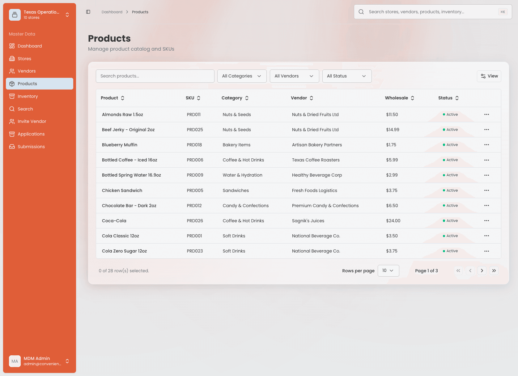
What this looks like, live
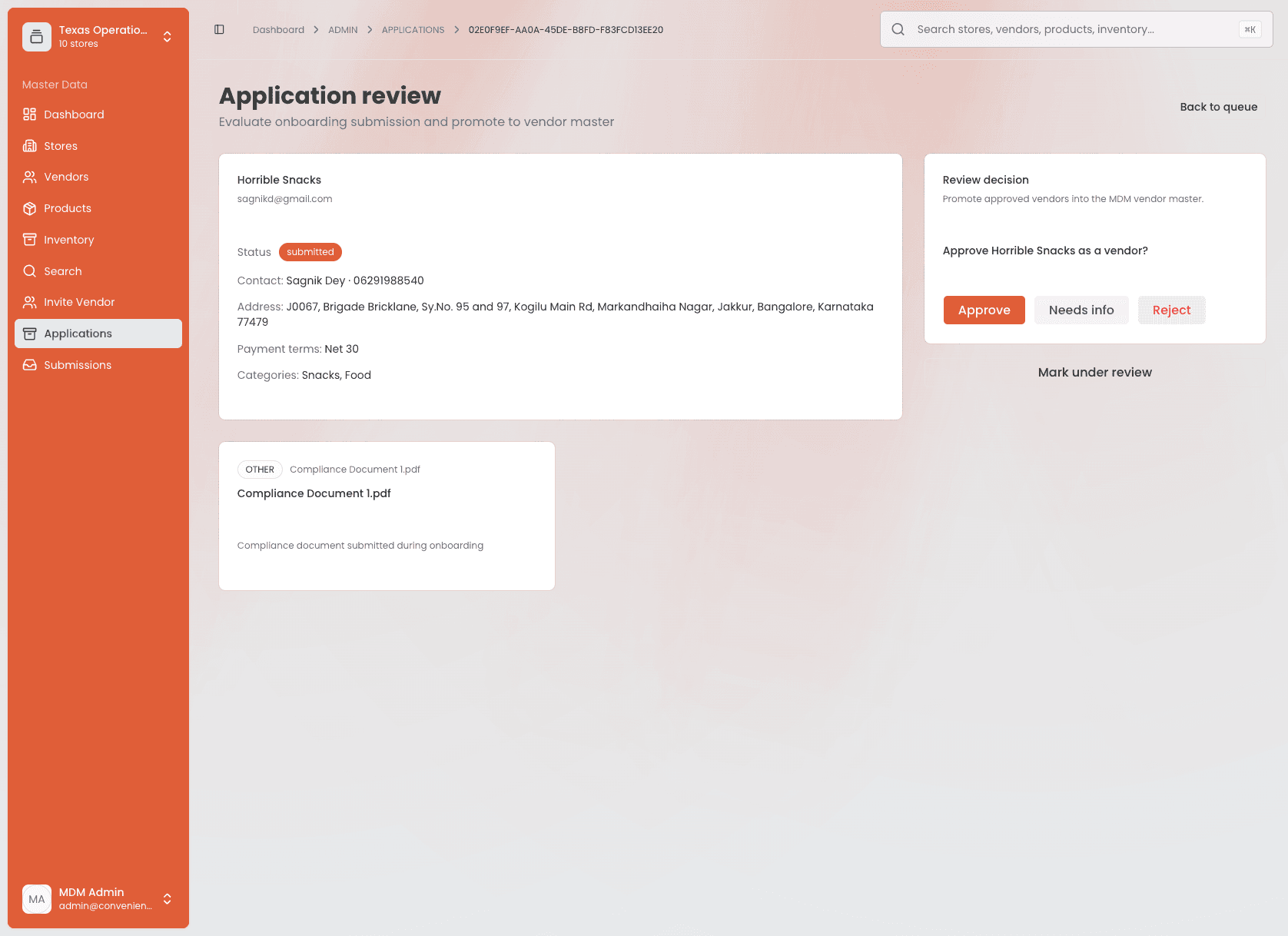
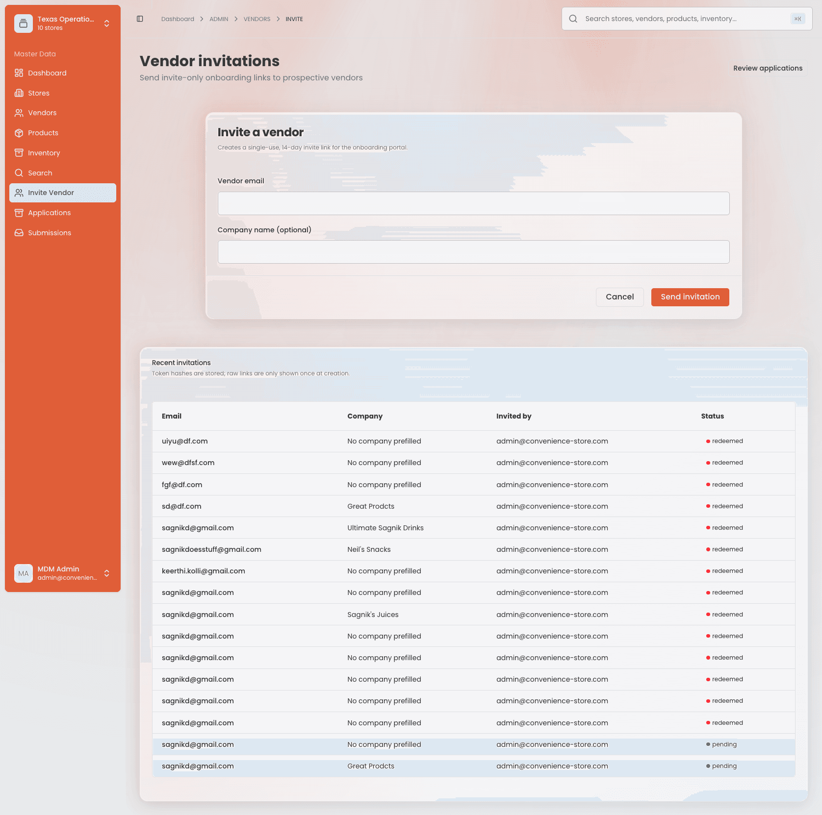
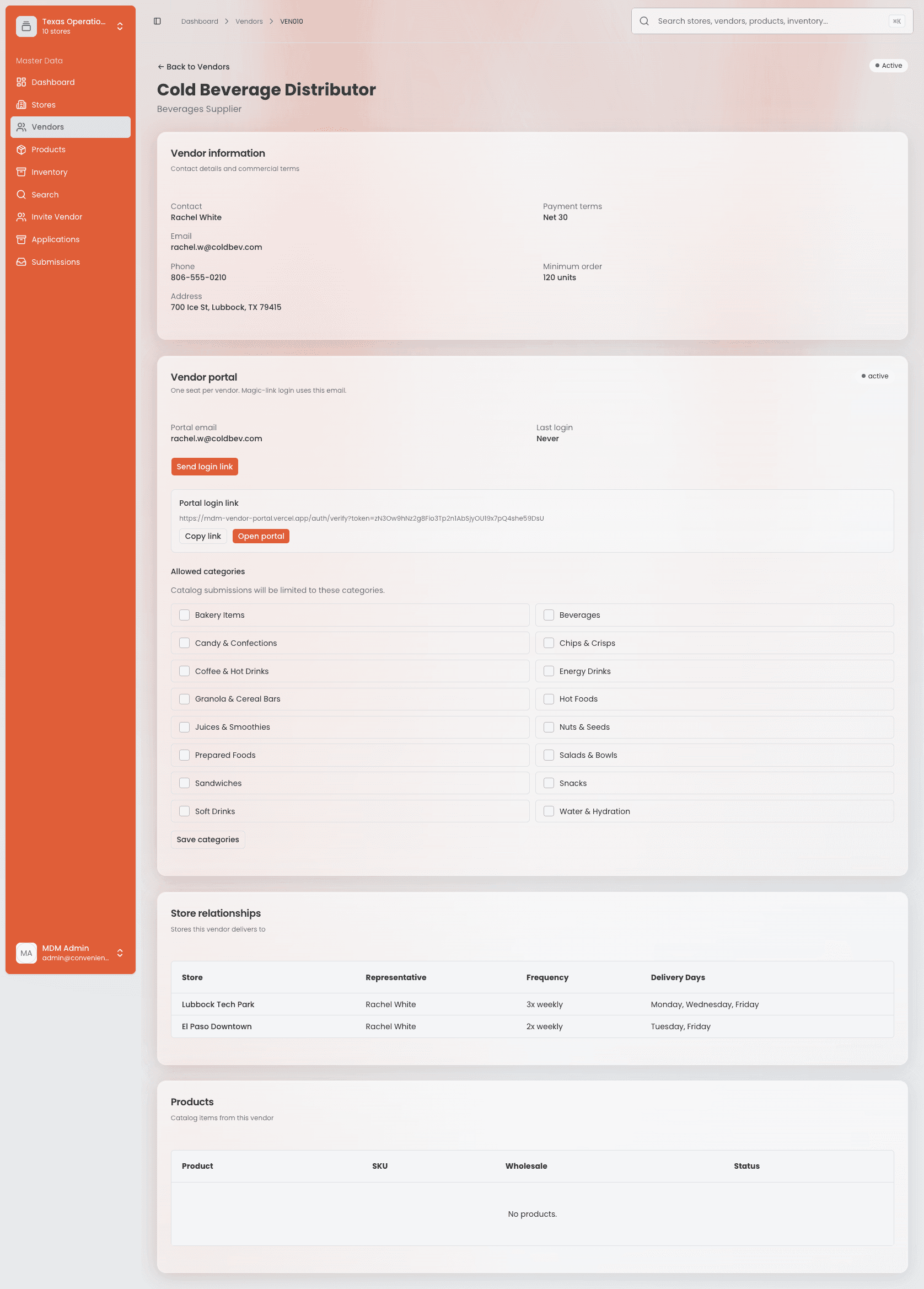
What this looks like, live — all three product apps are deployed and running against the shared database:
Staging-and-approval backbone
The single most important design decision: nothing a vendor submits touches master data directly. Every vendor-initiated change lands in a staging table with a status field. An admin acts on it. Only then does promotion write into live vendors or products tables. Orders are the deliberate exception — reversible and fast enough to write into an order state machine instead of staging.
| Vendor action | Staging | On approval |
|---|---|---|
| Edits profile | vendor_edit_requests | Updates vendors table |
| Submits new product | product_submissions + line items | Inserts products, assigns MDM SKU |
| Edits existing product | product_edit_requests | Updates products table |
| Decision | Choice | Why |
|---|---|---|
| ORM | Drizzle for CRUD, raw SQL for analytics | Cross-table inventory and vendor-performance queries needed hand-tunable SQL that Prisma's abstraction fought against. |
| Vendor auth | Magic-link only, no passwords | Removes credential-management UX and support burden for v1; sessions stay scoped, signed, httpOnly, and separate from staff auth. |
| UI | shadcn/ui + curated Beautiful UI | Professional baseline without hand-rolling a design system before the product proved its shape. |
| Deploy | Vercel · three projects | Matches the three-app split — each surface scales and deploys independently. |
| Sensitive data | Tokenization, never raw storage | Invite tokens stored as SHA-256 hashes; banking via provider tokenization, storing only a token and last four digits. |
03 · Design system approach
Rather than invent a bespoke component library before the product needed one, the foundation is shadcn/ui, extended with a curated Beautiful UI set mapped to specific screens — not imported wholesale.
Consistency without upfront DS overhead
shadcn primitives cover the bulk of an admin console and multi-step wizard — accessible and well-tested by default.
Shared packages, not shared apps
packages/ui holds the common component layer all three product apps consume — consistency enforced structurally, not by convention.
Design at the composition level
The UX work isn't inventing button styles — it's which fields appear on which step, how validation reads inline vs on submit, and how a bulk-upload preview communicates mixed valid/invalid rows.
Lamplight UI Kit
The shared-packages claim isn't just structural intention — it's backed by a live docs site. apps/design-system is a fourth Turborepo app, deployed on Vercel as the Lamplight UI Kit, documenting packages/ui (@workspace/ui) directly from source.
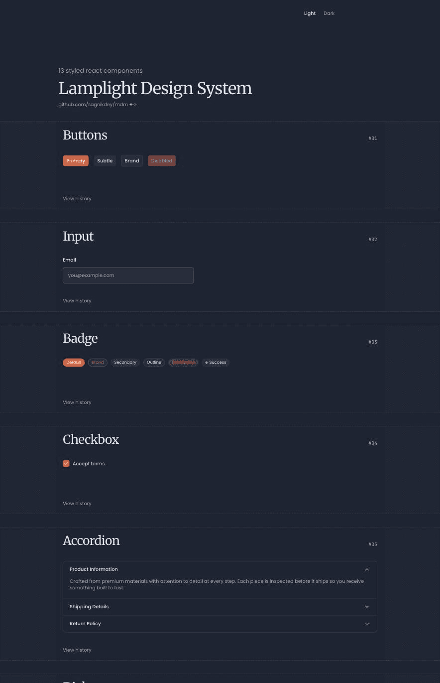
13 documented primitives
Button, Input, Badge, Checkbox, Accordion, Dialog, Dropdown, Breadcrumb, Spinner, Select, Tooltip, Tabs, and Toast — each with a live interactive demo plus a View history link to the component file on GitHub, so docs can't quietly drift from code.
Three foundation pages
Colors, Typography, and Radius & Shadows document the semantic tokens — with full light/dark theme pairs — that every product app draws from.
Same stack it documents
Radix UI, Tailwind v4, class-variance-authority, and next-themes — the design-system app is itself proof the primitives compose cleanly, not a static style guide describing them.
Structurally can't go stale
Adding a component is a two-step code act — drop a demo into components/demos/ and register it in lib/docs-registry.ts — and navigation plus the per-component page update automatically.
The result is a design system a reviewer (or hiring manager) can click through and inspect — not a paragraph asserting that consistency was handled.
↗ Open Lamplight UI Kit04 · Vendor onboarding
Vendor onboarding is the most fully specified part of the product — a form problem and a trust problem at once: asking a business for sensitive information before they've received value back.
Seven principles
Progressive disclosure
Never one 40-field form — break it into steps small enough that each screen feels manageable.
Ask only what's needed, when it's needed
Banking details come after interest is established, not on step one.
Save and resume
Every step autosaves a draft; vendors abandon and return constantly, and losing progress is the fastest way to lose a relationship before it starts.
Validate inline, early
Catch a malformed EIN or email the moment a field loses focus, not at final submit.
Be transparent about what happens next
A visible progress stepper and honest review-timeline expectations reduce support inquiries and anxiety.
Smart defaults and autofill
Remit-to same as HQ checkboxes, address autocomplete, copy-forward wherever the data already exists.
Two-sided by design
The vendor-facing wizard is only half the product; the admin review queue needed equal design attention.
The flow
Company Profile
Legal name, DBA, EIN, type, web
Contacts
Primary, AP, sales rep
Addresses
HQ, remit-to, ship-from
Product Categories
What they supply — drives compliance
Commercial Terms
Payment terms, MOQ, lead time
Compliance Docs
W-9, COI, license, food certs
Banking / Payment
ACH via secure provider
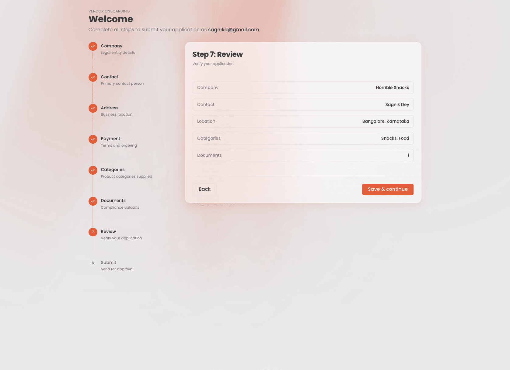
Review & Submit
Final confirmation
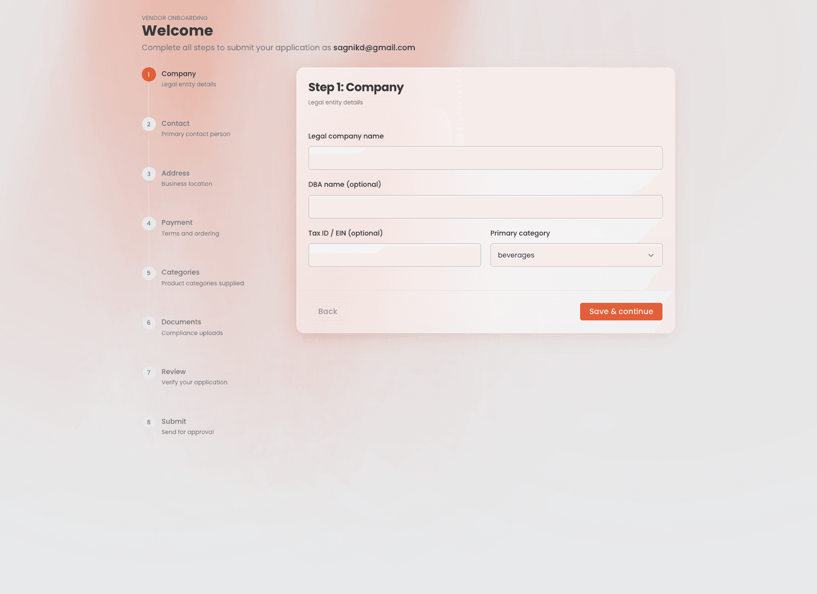
Company profile first
Lowest-friction, highest-identity data — and immediate dedupe against existing vendors before master data is polluted.
Categories mid-flow
That selection drives every downstream conditional requirement. Food vendors get food-safety docs; beverage-only vendors don't. Category-aware compliance is what separates this from a generic form.
Compliance and banking last
Highest-friction, most-sensitive steps sit after six steps of investment — vendors are more likely to push through than if banking were asked on screen two.
Status state machine
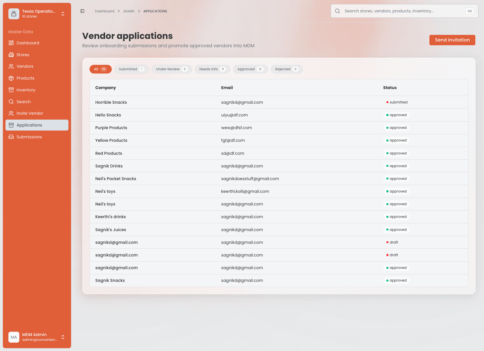
Draft
Submitted
Under review
Needs info
Approved
Rejected
needs_info is a deliberate UX decision: reviewers can request changes to specific fields, and the vendor gets a targeted, resumable edit — not a full resubmit. That single state prevents rejection-and-restart friction a binary approve/reject model would create.
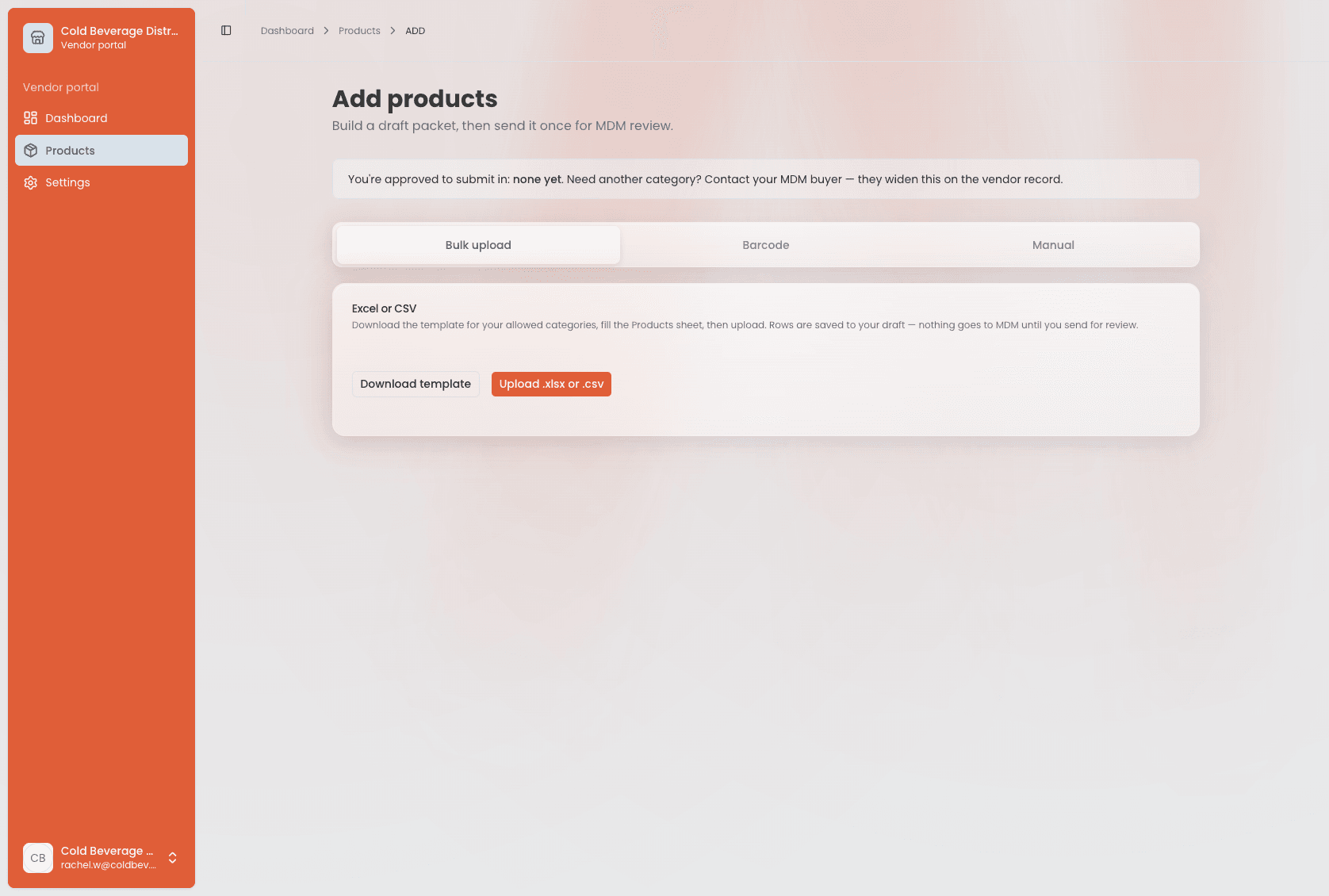
Product onboarding once live
Bulk Excel upload
For initial catalog loading or large additions. Templates are personalized per vendor — an Allowed Values sheet reflects that vendor's approved categories.
Barcode scan
For the one-new-item case — roughly 10× faster than manual entry, with a server-side fallback chain across barcode databases.
Manual entry
Fallback when there's no barcode match or fields automated paths can't populate.
Bulk-upload UX accepts unknown columns with a soft skip notice, silently skips empty trailing rows, and lets vendors fix validation errors inline in a preview table — push-back against a "just re-upload" default that punishes a single typo with a full cycle.
Journey maps: vendor and admin, side by side
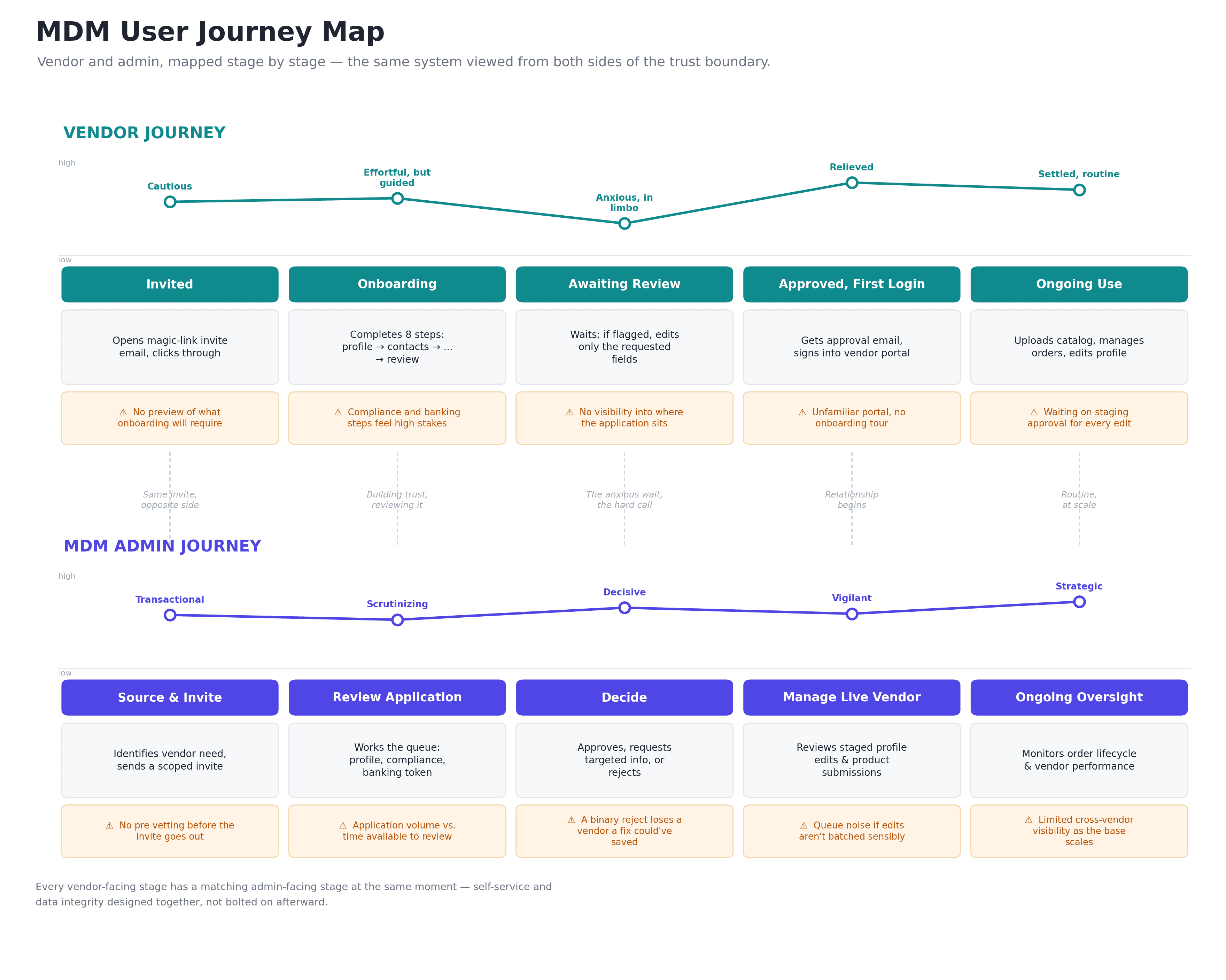
Everything above reads as a single flow, but it's really two: a vendor moving through onboarding into ongoing self-service, and an MDM admin who reviews, approves, and protects master data at every one of those same moments. Mapping both side by side — rather than just the vendor path — is what actually surfaces the design insight behind the whole product: self-service and data integrity were designed together, stage by stage, not bolted on afterward.
The emotional low point isn't symmetric
The vendor's steepest dip is Awaiting Review — anxious, in limbo, no visibility. The admin's low point is one stage earlier, at Review Application — scrutinizing a queue against limited time. That mismatch is why a visible progress stepper (vendor) and batched, category-conditional queues (admin) were designed as a pair.
needs_info sits at the hinge
It's the design response to the vendor's worst stage and the admin's Decide stage in the same beat — converting a hard reject or soft approve into a resumable, targeted fix on one side and a non-binary decision on the other.
Trust changes shape at Approved
The vendor's arc turns from cautious/anxious to relieved right where the admin's turns from scrutinizing to vigilant and strategic — the relationship shifts from prove you're legitimate to run your business here, and the product's job shifts from gatekeeping to enabling.
The full stage-by-stage detail — thinking, emotion, pain point, and design response for every stage of both journeys — lives in MDM-User-Journeys.md, one of the standalone specification documents referenced in the AI collaboration section.
05 · Domain-aware validation
Validation rules aren't uniform — they're conditional on category. Encoding that correctly is as much a UX decision as a technical one.
Category-driven compliance
Required onboarding documents are computed server-side from selected product categories — food vendors see food-safety docs; general merchandise vendors don't see fields that don't apply.
Category-conditional product fields
Pack hierarchy, physical attributes, and regulatory fields vary by category so manual and bulk paths never present irrelevant fields.
Constraints, not suggestions
Vendors can only submit products in categories selected at onboarding — surfaced proactively in the UI, not discovered after a rejected submission.
06 · How AI fit into the work
Claude was used throughout in two distinct modes, roughly equal in weight — and the how matters as much as the what.
Design & product thinking partner
- Scoping calls — magic-link-only auth, deferring product images, single-seat vendor accounts for v1, with second-order consequences surfaced before cutting.
- Domain modeling — the staging/approval pattern arrived through iterative conversation about what master data integrity requires structurally.
- UX sequencing — onboarding order and product-entry path order stress-tested by asking Claude to argue for alternatives before locking instinct in.
Engineering accelerant
- Spec-to-schema — Drizzle tables, enums, and relations drafted from agreed UX flows so the DB model and user steps stayed in lockstep.
- Repo-grounded work — recommendations based on the actual GitHub structure, not a hypothetical codebase.
- Discrete, versioned outputs — standalone markdown specs (vendor portal, product onboarding, database guide, MDM-User-Journeys.md) the implementation phase could build against, with precise scoped edits instead of full rewrites.
Where the line stayed human
Every architectural call, scoping tradeoff, and UX sequencing decision was mine. Claude generated options, argued the counter-case, and produced clean, implementation-ready output once a direction was set. Product judgment — what trustworthy master data requires, what a vendor will tolerate, which corners are safe for v1 — stayed human throughout.
07 · Current state
Done
- Full data model and staging/approval architecture, finalized
- Vendor onboarding flow fully specified end-to-end, including admin review
- Vendor portal architecture and product onboarding module fully specified
- apps/web admin console live — dashboard, invite flow, review surfaces against shared Postgres
- apps/vendor-portal live — approved-vendor dashboard scoped to vendor data
- Lamplight UI Kit (apps/design-system) live — 13 primitives + foundation tokens documented from source
In progress
- Building out apps/onboarding and apps/vendor-portal against the finalized specs
- Wiring the Drizzle schema and staging pipeline into working CRUD flows
Deferred
- Product images (Vercel Blob planned once catalog flows are stable)
- Multi-seat vendor accounts
- Vendor self-service category expansion
- AI copilot / agent-native UI components — scoped out rather than bolted on prematurely