Case study · AI-assisted design & development · iOS
QuickStop
A convenience-store app built around one premise: give customers their time back. An end-to-end, AI-assisted workflow — research, information architecture, Figma screens, and a native SwiftUI port — designed for certainty at the point of need.
5
5
10
70+
Overview
QuickStop is a convenience store app built around a single premise: give customers their time back. Convenience stores fail at the one thing in their name — lines, out-of-stock items, awkward checkout — so the app targets five distinct user mindsets, each with a different definition of “fast.”
This case study documents an end-to-end AI-assisted workflow: research and strategy, information architecture, interaction design in Figma, and a full port to native iOS in Swift.
01 · The problem
Current convenience store apps, where they exist at all, are glorified loyalty cards. They don't solve the core friction: uncertainty. Is the item in stock? How long is the line? Will my mobile order be ready, or sitting open on a shelf anyone can grab?
The opportunity was to build for certainty — and let speed follow naturally from that.
02 · User research & personas
Using Claude, five personas were developed from a bottom-up analysis of real convenience store use patterns — not broad demographics, but specific jobs to be done at different times of day. Each came with pain points, needs, and a priority weighting across Speed, Freshness, Reliability, and Discovery, which became the decision criteria for the rest of the project.
01 · The Commuter
Marcus Hale, 32 · Sales Rep
Order-ahead and a 90-second in-and-out.
02 · The Night Shifter
Priya Ramanathan, 28 · ER Nurse
Curbside pickup and fresh-food transparency at 3am.
03 · The Bulk Buyer
Danny Reyes, 41 · Contractor
Group orders, business receipts, crew presets.
04 · The Impulse Local
Zoe Kapoor, 19 · Student
Scan-and-go, discovery, three taps max.
05 · The Emergency Errand
Sarah Mitchell, 38 · Parent / WFH
Sub-15-minute delivery and verified real-time stock.
Key insight
Across all five, the unifying need is certainty — that the item is in stock, that the line won't kill them, that the trip will take exactly as long as expected.
03 · Information architecture
The IA was worked out iteratively with Claude — proposing structures, stress-testing them against each persona's flow, and revising. The starting point was five tabs: Home, Shop, Orders, Store, You.
01
Scan & Go becomes a top-level tab
It was nested inside Shop as a mode. I promoted it because it's a mode of being in the store, not a browsing mode; it has a fundamentally different input model (camera-first vs. browse/search); and Zoe's “three taps or abandon” constraint is much easier to hit from the tab bar.
02
Store folds into Home's smart header
To keep the nav at five tabs, live inventory, hours, and locations moved into Home rather than a tab of their own. That pulls the certainty layer closer to the first screen every user sees.
03
Group ordering deferred to v2
Crew/group ordering, business accounts, and itemized tax receipts were scoped out to keep v1 shippable.
Final nav (v0.3)
| Tab | Purpose | Primary persona |
|---|---|---|
| Home | Smart entry — reorder, quick actions, store status | Marcus, Sarah |
| Shop | Browse catalog, Order Ahead + Delivery modes | Zoe, Priya |
| Scan | Camera-first in-store checkout | Zoe, Marcus |
| Orders | Active + historical, all pickup/delivery methods | All |
| You | Profile, payment, loyalty | All |
04 · Shop taxonomy
Shop was the most structurally complex section: ten top-level categories, each with subcategories and special filters, plus two age-gated categories that need a separate verification model.
- 01Hot Food & Pizza
- 02Coffee & Hot Drinks
- 03Cold Drinks
- 04Snacks & Candy
- 05Fresh Food
- 06Ice Cream & Frozen
- 07Beer, Wine & Spirits (age-gated)
- 08Tobacco & Vaping (age-gated)
- 09Grocery & Household
- 10Health & Beauty
Age-gated model: trust and confirm
Date of birth is stored once at account level, with a one-time-per-session cart acknowledgement and a manual visual ID check at handoff by the driver or associate. No in-app ID scanning in v1 — it's deferred to v2 as a drop-in addition to the same flow.
Persona-driven features
01
The Usual
History-driven reorder strip, built for Marcus.
02
New This Week
Discovery strip for Zoe — excludes age-gated items.
03
Need It Now
Emergency shortcut preset for Sarah.
04
Running Low?
Cadence-based reorder prompts.
05 · Design system setup
Before designing screens, I established the color system. The palette was extracted from Figma's Apple Design System file through Figma MCP and exported as a production-ready Swift file, which removed the manual copy-paste step entirely.
Teal
#30C5FF
brandPrimary
Forest
#5C946E
brandAccent1
Sage
#80C2AF
brandAccent12
Sky
#A0DDE6
brandAccent13
The output, DSColors.swift, is a SwiftUI + UIKit extension covering brand colors, system and grouped backgrounds, labels, fills, separators, and overlays — 70+ tokens, all with Light and Dark values.
06 · Screen design in Figma
Screens were built in Figma from the Apple Design System library with QuickStop tokens applied. Through Figma MCP, Claude wrote and executed plugin code directly in the file — creating frames, placing components, setting fills, wiring auto-layout — instead of me building each screen by hand.
01
Shop Landing
Search bar, Order Ahead / Delivery mode selector, “The Usual” card, and a 10-category grid with age-gated lock badges.
02
Cold Drinks category
Subcategory chips, a featured banner, and a sectioned product grid with stock indicators.
03
Product Detail
Product image, nutrition facts grid (calories, sugar, caffeine, serving), and a “frequently bought together” strip.
04
Onboarding, six screens
Value prop, location permission, category preferences, sign-in, first-order preset, then success with a habit prompt.
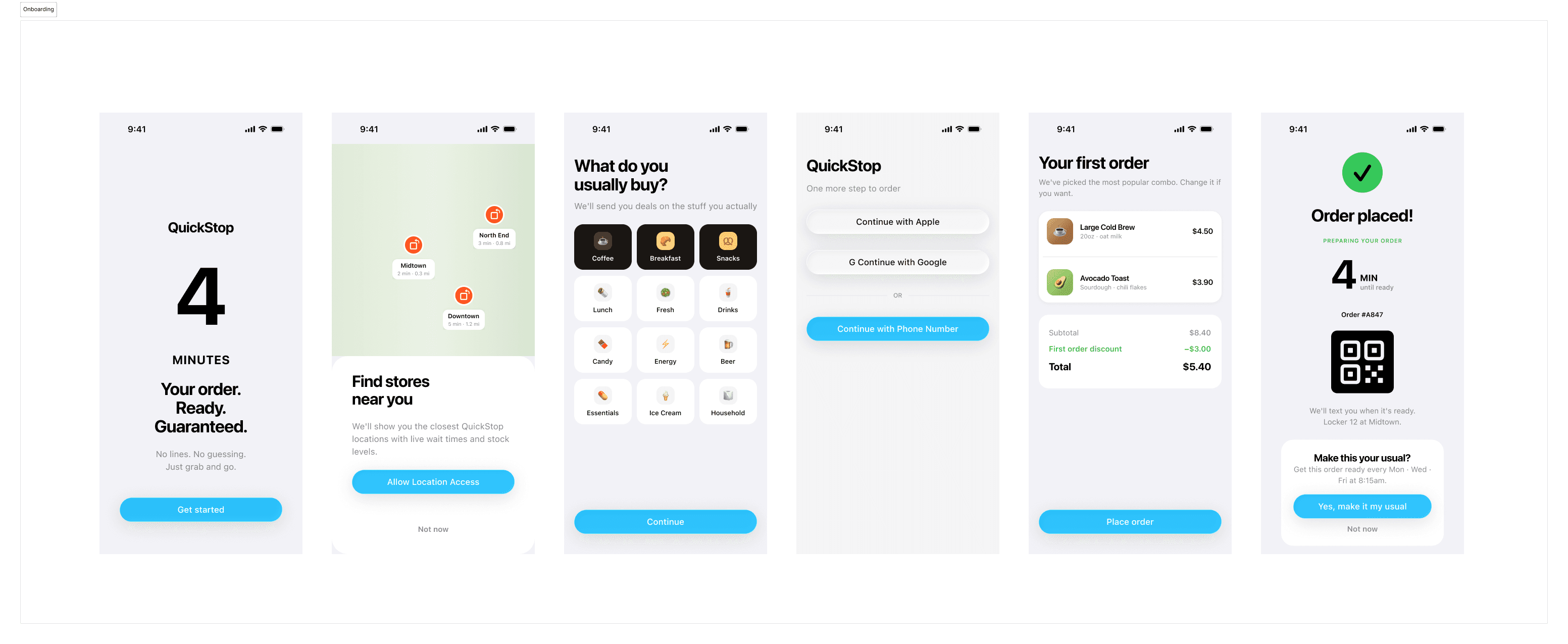
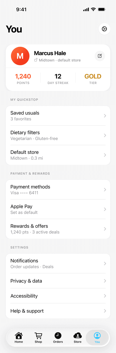
SF Pro throughout, QuickStop teal for primary actions, iOS system greens, oranges, and reds for stock status, #F2F2F7 grouped backgrounds, and a 14pt card radius with continuous corners.
07 · iOS development in Swift
The designs were ported to native SwiftUI and UIKit, with DSColors.swift as the bridge between design and code. The project separates concerns strictly: an atomic hierarchy for UI components, and a feature-based structure for product areas.
Quickpitstop/
└── Sources/
    ├── App/            # Entry points
    ├── Components/     # Atomic design system
    │   ├── Atoms/        DSButton, DSBadge, DSTextField…
    │   ├── Molecules/    ProductCard, StockBadge, CartItemRow…
    │   ├── Navigation/   DSTabBar, DSToolbar
    │   └── Organisms/    ProductGrid, CartSummary…
    ├── DesignSystem/
    │   └── Tokens/       DSColors, DSTypography, DSSpacing,
    │                     DSRadius, DSShadow
    ├── Features/       # Home, Cart, Orders, Search, Account, Auth
    ├── ViewModels/
    └── PreviewMocks
01
Tokens only, no magic numbers
Views use Color.brandPrimary, Color.backgroundSecondary, and the DSSpacing / DSRadius constants. No hardcoded hex values appear in feature or component code, and Light/Dark is handled entirely at the token level.
02
Figma hierarchy mirrored in code
A molecule in Figma maps to a molecule in Swift. The asset catalog follows the Figma variable groups (Brand/Primary, Backgrounds/Secondary, Labels/Primary), so handoff is mechanical rather than interpretive.
03
Real-time backend for the core promise
ConvexMobile syncs live inventory, order status, and stock levels — directly serving the promise of certainty. Stripe handles payment in checkout.
04
Feature folders with preview fixtures
Each product area owns its views and shares state through the ViewModels layer. PreviewMocks supply fixture data so SwiftUI previews work with no live backend.
Cursor-assisted development
The Swift implementation was built in Cursor with the project structure and DSColors.swift as persistent context. It scaffolded each atom and molecule from a description of its Figma equivalent, resolved the right token for each use, generated preview mocks alongside components, and propagated token renames across every component file in one pass.
08 · AI workflow — what actually changed
What AI accelerated
- Persona generation and synthesis: hours down to under an hour
- IA iteration: propose, critique, and revise in one session
- Shop taxonomy: category naming, subcategory logic, age-gating edge cases
- DSColors.swift: extracted from Figma rather than transcribed
- Figma screen construction: plugin code written and executed via MCP
What still needed human judgment
- Deciding which structural option was right (Scan & Go promotion, Store into Home)
- Visual taste: checking designs looked right, not just structurally correct
- Scoping what goes in v1 versus v2
- Swift architecture decisions during the native port
The workflow didn't remove design judgment — it removed the time between having a judgment and seeing it rendered.
09 · Open questions & what's next
Open questions (v1)
- First-time DOB prompt: onboarding (less friction later) or just-in-time (only when needed)?
- Under-21 accounts: hide age-gated categories entirely, or show a locked state?
- Scan & Go geofencing: require in-store location to activate the scanner, or always available?
- Home personalization: how aggressive on day one with no behavior history?
What's next
- Age-gated checkpoint sheet (the ID-required modal at cart level)
- Orders tab: active order tracking and pickup-method screens
- Scan & Go flow: scanner UI, cart drawer, exit and pay
- v2 scoping: crew/group ordering, business accounts, in-app ID verification