Case study · Design Thinking · iOS
Vesta
A pantry intelligence app designed and built solo — voice input, barcode scanning, and receipt parsing so inventory stays accurate without manual data entry. Structured through Empathize → Test, including the pivots that didn't survive contact with reality.
3
4
5
1
Overview
Vesta is a home inventory and pantry management app that tracks what's actually in your kitchen using voice input, barcode scanning, and receipt parsing — instead of manual data entry. Say "used two cups of flour" and inventory updates instantly. Photograph a receipt and a whole grocery run gets logged. Run low on something and it lands on the shopping list automatically.
I ran this as a solo build, but deliberately structured it through the design thinking process rather than jumping straight to screens. That discipline is what surfaced three major pivots — each one a return to Empathize or Define after new evidence, not a restart from scratch. This case study walks through the project stage by stage, including the parts that didn't survive contact with reality.
01 · Empathize
I'm the primary user — this started as a personal problem, not a market brief — but I treated that as a starting hypothesis to interrogate, not a shortcut past research. The empathize phase was built around two tracks:
01
Competitive teardown
A full week of hands-on use with four existing pantry apps (KitchenPal, Cooklist, Your Food, Pantry Check) — documenting exactly where each one breaks down in real use. Not feature comparison: friction-point observation. Where does logging get skipped? Where does the inventory silently drift from reality?
02
Structured interview plan
A 10-interview research protocol targeting the questions that matter: how people currently track what's at home (usually a mental model, or nothing), when they discover they've run out (almost always mid-cook or at the store), and — for anyone who'd tried a pantry app before — what specifically broke the habit.
What I took out of this phase
The research plan was built to validate or kill one hypothesis before any engineering happened — if logging feels like a chore, accuracy decays and the app gets abandoned, no matter how good the tracking model underneath it is. Every existing competitor fails at the same point: the data-entry step, not the data-storage step. That reframing shaped everything downstream — the product isn't a database with a nice UI, it's a friction-removal problem.
02 · Define
Point of view
A person cooking regularly needs to know what's actually in their kitchen without spending effort keeping that record accurate — because the moment tracking becomes a chore, it gets abandoned within days and the inventory silently rots out of sync with reality.
That statement did real work — it ruled things out as much as it pointed things in. "Just build a good inventory list app" was never on the table: dozens of apps already do that competently, and they still fail at retention. The core need isn't storage or organization, it's near-zero-friction logging.
Design principle
If logging usage is as fast as saying it out loud — no unlocking, no searching, no typing a quantity — accuracy holds.
Voice input isn't a novelty feature bolted onto an inventory app. It's the mechanism that makes the whole product viable. Everything else (barcode scan, receipt photo, health scoring) exists to solve the cold-start problem — getting the pantry populated in the first place — while voice solves the ongoing accuracy problem.
03 · Ideate
The ideation phase produced a genuinely ambitious concept: a multi-household, cross-platform consumer product. I pushed the idea as far as it could go before applying any constraint, because scoping down from an over-built idea is a more honest process than scoping up from a timid one.
01
Four-phase roadmap
Core inventory → recipe matching with one-tap Instacart ordering → full household categories (personal care, pharmacy, EWG safety scoring) behind a premium tier → predictive auto-reorder and household budget intelligence.
02
Information architecture
Five tabs organized around the four distinct ways an item enters or leaves inventory — barcode, voice, receipt/shelf photo, and manual — rather than around arbitrary screens.
03
Visual identity
Warm, kitchen-native — deliberately not clinical like a health app and not cartoonish like food delivery. Off-white palette; terracotta / sage / amber tied to health-score states; serif display only for screen titles; monospace for quantities so numbers align down a list.
04
Signature interaction
An item card with a colored left border mapped to a computed health score, so a household's health composition is scannable at a glance without opening a single item.
The Home screen, three very different ways
Before converging on a direction, I pushed three genuinely different visual personalities for the same Home screen — same data, three different theories of what the app should feel like.
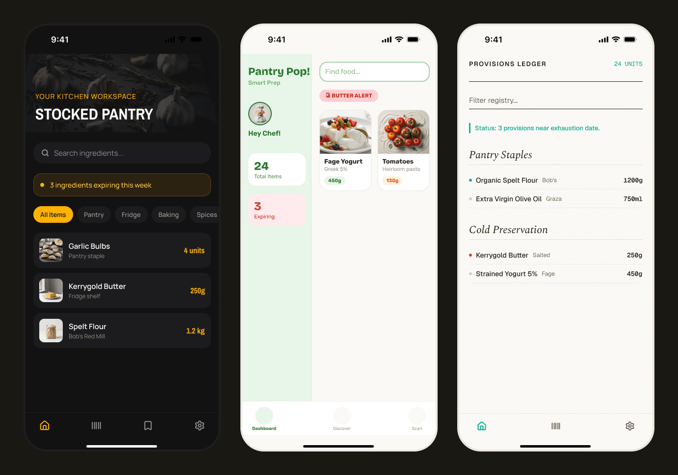
"Stocked Pantry" — dark, moody, photography-heavy
Looked expensive, read as a developer tool or a wine-cellar app, not a kitchen. Too cold for something meant to live next to a stove.
"Pantry Pop!" — bright, mascot-driven, emoji alerts
This one quietly broke my own design principle: I'd explicitly ruled out "playful like a food-delivery app" back in Define, and here I was reinventing it from a different angle. A principle only works if new ideas actually get checked against it — this is the check catching something.
"Provisions Ledger" — serif type, formal rows, small caps
Elegant, but it read as a spreadsheet wearing a nice font — the opposite of "unhurried kitchen drawer."
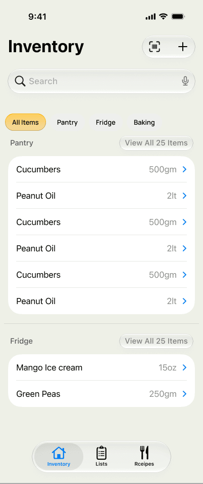
The signature pattern that survived from here on: a colored indicator per item tied to its computed health score, so the whole pantry's composition is scannable without opening anything.
Idea I generated and deliberately killed
A seven-screen guided onboarding tour (welcome → location setup → seeding-method choice → camera capture → review → voice demo → ready). Good UX thinking for a stranger downloading cold — completely wrong for the actual current user: one person who already knows what the app does. Kept on file for a future public-launch scenario rather than building it now. Knowing which good ideas to not build yet is as much a design decision as generating them.
04 · Prototype
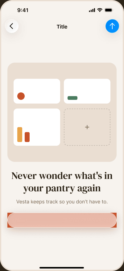
I treated the full-platform concept from Ideate as a paper prototype for feasibility, not a build target, and it failed the test fast: a backend to run and pay for indefinitely, multi-user auth solving a problem I didn't have, and four separate API integrations before validating whether the core loop worked for even one person. So I prototyped down, in two rounds:
01
Round 1 — solo, fully on-device
Rewrote the product spec for one person, iOS-only, no backend, SwiftData instead of Postgres, on-device speech recognition and on-device AI parsing instead of cloud calls. This was the version I started building against.
02
Round 2 — the AI engine swap
Two weeks in, reality intervened: Apple's on-device Foundation Models framework was beta, hardware-locked to the newest chips, and — by my own risk assessment — measurably weaker on the compound, ambiguous sentences that voice logging depends on. Shipping the product's one differentiating feature on its least-proven engine was the wrong bet. The AI layer got rebuilt behind a swappable protocol interface (UsageIntentParser, ReceiptParser), with a hosted model as the default and the on-device path preserved but demoted.
Protocol over polish
That protocol layer is the single most important prototyping decision in the project. It meant every subsequent reversal — cloud to on-device, on-device back to cloud — touches one interface, not the whole app. In a solo build with no team to absorb the cost of a wrong bet, a prototype that's cheap to unwind is worth more than a prototype that's polished.
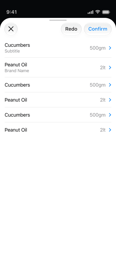
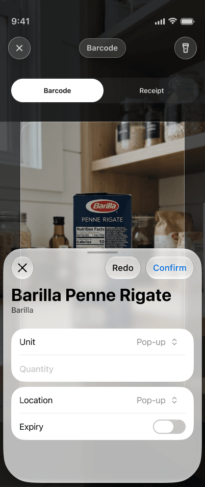
I also prototyped the trust mechanism that makes AI-assisted logging usable at all: every model-driven action — barcode match, voice parse, receipt scan — surfaces a confirmation screen before anything commits to the data model. Low-confidence results get flagged amber with inline edit, never a silent guess. This one pattern repeats across four different entry points because it's the actual answer to "how do you trust an app that's writing to your inventory based on a transcription."
05 · Test
Testing here has run in two forms so far, with a third planned before public launch.
01
Assumption-testing against my own risk log
Rather than waiting for a beta cohort to discover the on-device AI weakness, I wrote the accuracy bar down before building against it: on-device parsing gets promoted to default only if it lands within five points of the hosted model on a 50-transcript test set, and manual-correction rate stays under 10% in two weeks of real daily use. A test with a pre-registered pass/fail line — deliberately so a future "should we switch engines?" conversation is a measurement, not a re-litigation.
02
Security and platform constraints
Flagged and gated before it became a shipped mistake: an API key embedded in a client binary can be extracted, so a serverless proxy is a hard requirement before any public release — not optional hardening. Also tested against Apple's actual review requirements: permission-prompt copy, privacy disclosures, and data-use declarations for camera, microphone, speech, and third-party AI processing.
03
What's currently in test
TestFlight distribution on iOS 17+, with the hosted parser live behind the proxy. Household-level testing (multiple real kitchens, different grocery-store receipt formats, different ambient kitchen noise for voice) is written up as a companion testing guide — treating "does this work in someone else's kitchen" as distinct from "does this work in mine," since a solo builder's own kitchen is a sample size of one.
Still to test
Still to test before App Store submission: real barcode/receipt accuracy across households with different grocery brands and receipt formats, and whether the on-device parser clears the pre-registered accuracy bar.
06 · What this project demonstrates
01
A real Empathize → Define cycle
Not a skipped step — the problem statement (friction kills accuracy, not storage quality) is what ruled out "just build a nicer list app" and pointed at voice as the core mechanism.
02
Ideation disciplined by scope
Not abandoned by it — the ambitious platform concept wasn't wasted; its visual system and IA held, while its infrastructure got cut for a solo build.
03
Prototypes cheap enough to be wrong twice
The protocol-based AI architecture meant two full engine reversals cost an interface change, not a rewrite.
04
Pre-registered tests
Not retrospective justification — the on-device promotion bar and the API-key security gate were both written down before the code that would be judged against them.
05
Ownership of the whole loop
Research framing, problem definition, IA, visual system, and technical architecture were one continuous set of decisions, made and lived with, with no team to hand the hard tradeoffs to.
This case study covers the design and product-strategy work behind Vesta as of October 2026. The product is under active development; screens shown are from the in-progress Figma file and reflect the current build, not a final shipped state.
← Back to portfolio