CASE STUDYConcept · Real client
Carmelo’s: from phone-only to ordering online.
Carmelo’s Mexican Grill in Sugar Land, Texas has loyal regulars and a website that can’t take an order. I designed and built a first-party ordering site, a menu the restaurant runs itself, and a staff app for the kitchen — as a working concept to pitch to the owners.
- ROLE
- Designer, product manager and developer (solo)
- CLIENT
- Carmelo’s Mexican Grill, Sugar Land TX — concept for a pitch
- STACK
- Next.js 15 · Payload 3 CMS · Postgres · Stripe · Tailwind v4 · Vercel
- Google rating from 1,976 reviews
- 4.8
- Ways to order on the current site
- 0
- Dishes across 15 categories, run from the CMS
- 141
- Heuristic reviews, each driving a redesign
- 2
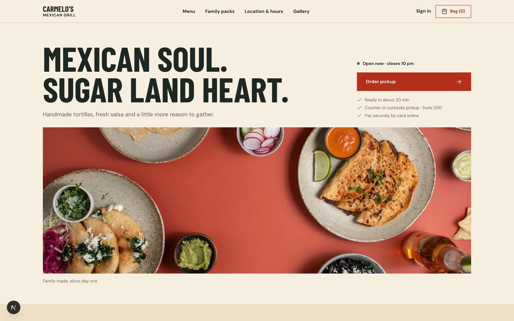
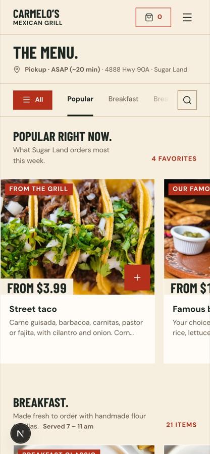 PHONE → MENU → BAG → PICKUP
Why we’re doing this
Carmelo’s is a family restaurant with a following: 4.8 stars from 1,976 Google reviews, with reviewers singling out the fajitas, the burritos and the fact that it’s family owned. People already want the food. What they can’t do is order it the way they order everything else.
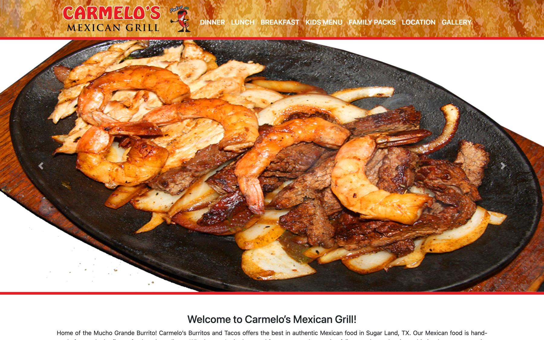
Today the restaurant’s own website is a brochure. To get food to go, you call the store, walk in, or use a third-party delivery app that takes a cut of every order and owns the customer relationship. The goal is simple: give Carmelo’s its own front door for orders, one the family controls.
The problem
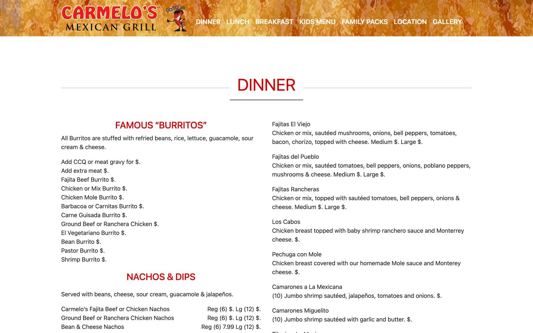
Customers find the website, then hit a dead end. There’s no way to order, and the menu isn’t a reliable source of truth.
- 01
No online ordering
Every to-go order is a phone call or a walk-in. Customers who won’t call go to a delivery app or go elsewhere.
- 02
A menu you can’t trust
Prices show as “$.” on the live menu. Dishes listed online sometimes don’t exist, and add-ons get swapped for something else.
- 03
Orders that depend on hearing right
Modifiers — no onions, extra queso, mojado — are taken by ear during the rush, when mistakes are most likely.
- 04
Margin and customers lost to apps
Third-party apps take a commission on each order and keep the customer’s details, not the restaurant.
The website brings people to the door, then gives them nothing to do but pick up the phone.
Who it’s for
I wrote the PRD around five people — three customers and the two people who run the store.
- Lunch-break LuisOrders on his phone during a 30–45 minute break. Wants a two-tap reorder and an accurate pickup time.
- Family-dinner FatimaFeeds 4–6 with family packs and kids’ plates. Cares about modifiers (no onions, mild salsa) and the total.
- Weekend-breakfast BrianOrders breakfast tacos for a group and wants them ready Saturday morning.
- Kitchen staffNeed orders with clear modifiers and pickup times, and a quick way to mark a dish sold out (“86 it”).
- Owner / managerEdits menu, prices and hours, pauses online ordering on a slammed night, and handles refunds.
How I approached it
- 01
Understand
Audited the current site and menu, wrote the PRD and an admin/CMS spec: personas, goals, scope, non-goals.
- 02
Structure
Modelled the menu (categories, items, modifier groups, service windows) and the order lifecycle before any screen.
- 03
Design
Figma frames for the storefront, then heuristic reviews of the built pages, fixed one issue at a time.
- 04
Systematize
One token set and component library for the storefront; shadcn on the same tokens for the staff app.
- 05
Scale
A CMS the family runs without me: menu, prices, hours, 86 board and refunds — and one location ready to become several.
Deciding when the docs disagreed
The PRD was written before the visual design, so the two disagreed in places. I logged every conflict and settled it once, in the build plan, rather than letting it resurface screen by screen.
| TOPIC | PRD SAID | DESIGN SAID | DECISION |
|---|---|---|---|
| Visual direction | Chile red, rounded, Fraunces/Inter | Ink and cream, square corners, Barlow Condensed + DM Sans | Design system wins; the PRD’s look was a pre-design guess |
| Data layer | Prisma + Postgres | Payload 3 on the same Postgres | Payload owns menu, content and orders — one model, one admin |
| Navigation | Menu · Catering · Location | Menu · Family packs · Location & hours · Gallery | Figma — it matches how the restaurant already talks |
| Menu layout | Left category rail | Sticky category bar over scrolling sections | Sticky bar — works the same on a phone |
| Special instructions | 140 characters | 200 characters | 140, confirmed — enough for a note, short enough to read on a ticket |
A menu the restaurant runs itself
The menu problem isn’t a design problem; it’s an ownership problem. Prices go stale and add-ons drift because nobody at the restaurant can edit the site. So the menu lives in Payload CMS, on the same Postgres database as the orders, and the storefront reads from it directly.
What the CMS models
- Categories with service windows — breakfast 7–11 daily, lunch specials 11–3 on weekdays
- Menu items with photos, dietary tags, price and a “from” flag when options change it
- Modifier groups: required or optional, min/max, priced add-ons (“Make it mojado”)
- Locations: hours, prep time and an online-ordering pause switch
- Orders, payments, refunds and an audit log of every change
Why it fixes the drift
- One source of truth: the price on the card is the price at checkout, re-checked server-side
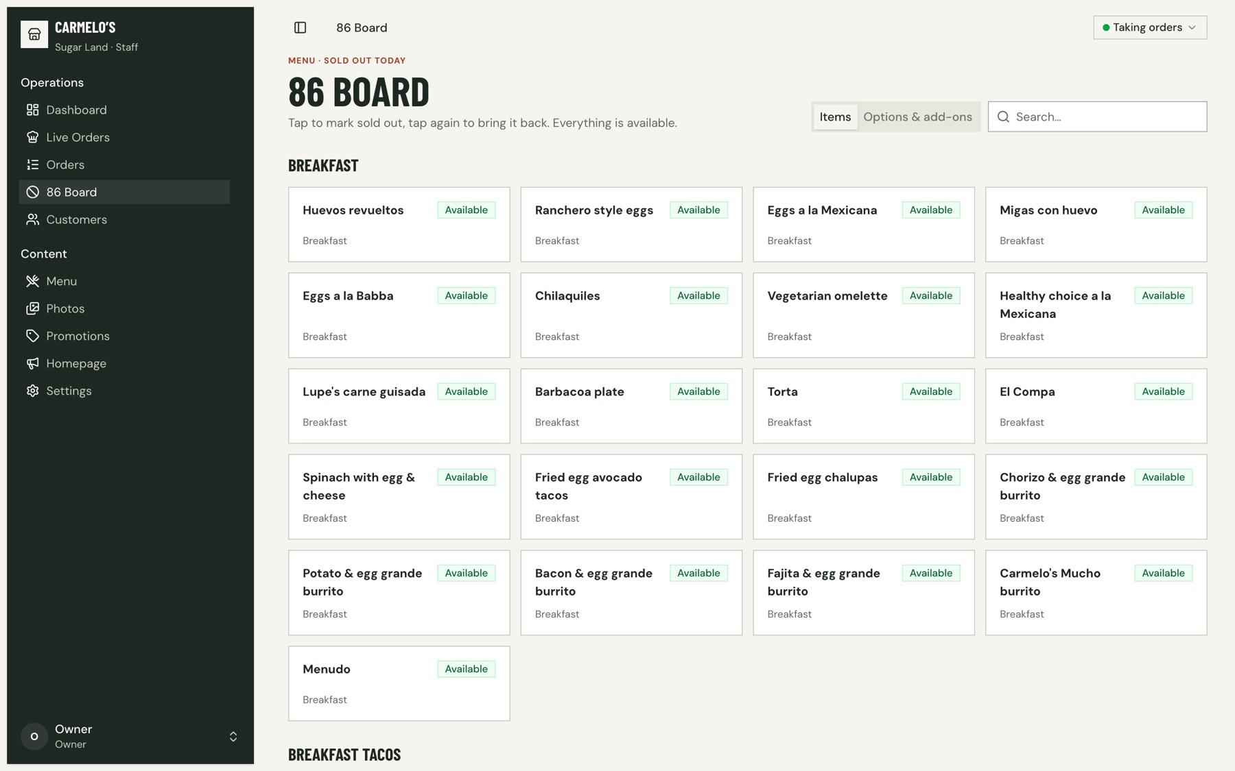
- Marking a dish sold out hides it everywhere in seconds — no stale listings
- Add-ons are data, not prose, so they can’t be quietly swapped
- Hours drive the storefront: the menu says when it’s closed and what’s next
- Built for one store, modelled for more without a migration
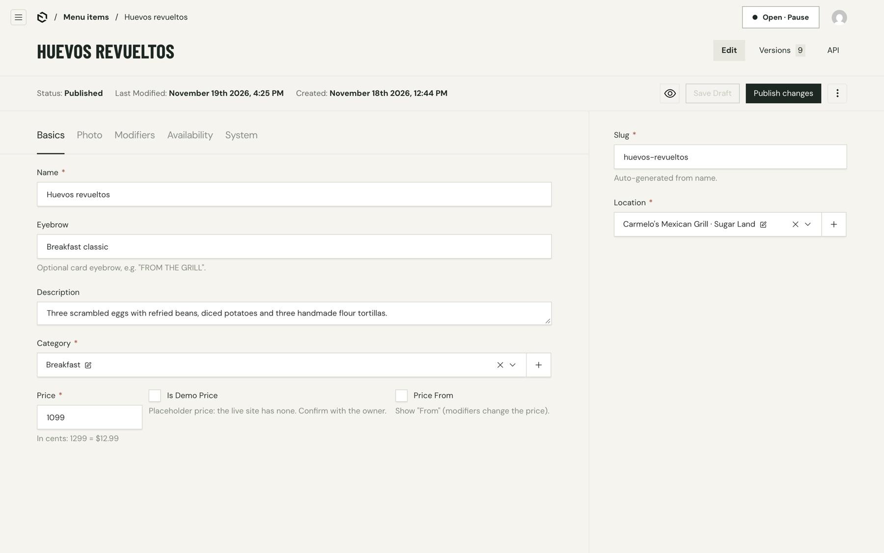
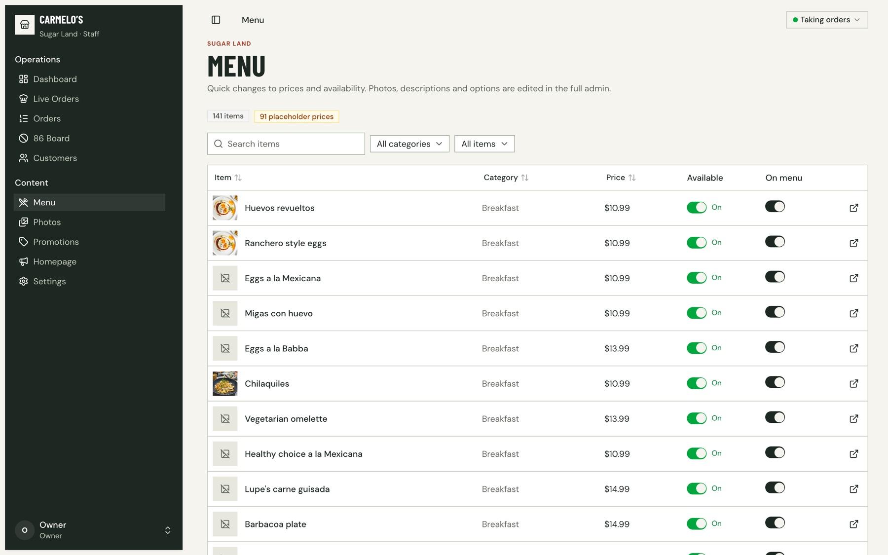
Because the current site is missing most prices, 91 of the 141 prices in the concept are flagged in the CMS as placeholders to confirm with the owner, and the staff menu counts them. The flag is part of the pitch: the first job after a yes is a price pass with the family, in the same editor they’ll use from then on.
Payload CMS (menu · hours · 86 board)
        │
        ▼
Storefront ──▶ Bag ──▶ Checkout ──▶ Stripe (authorise only)
                                        │
                                        ▼
                          Order ──▶ Staff app: Live orders
                                        │  accept → capture payment
                                        ▼
                          Status page + SMS/email ──▶ Pickup
Ordering, end to end
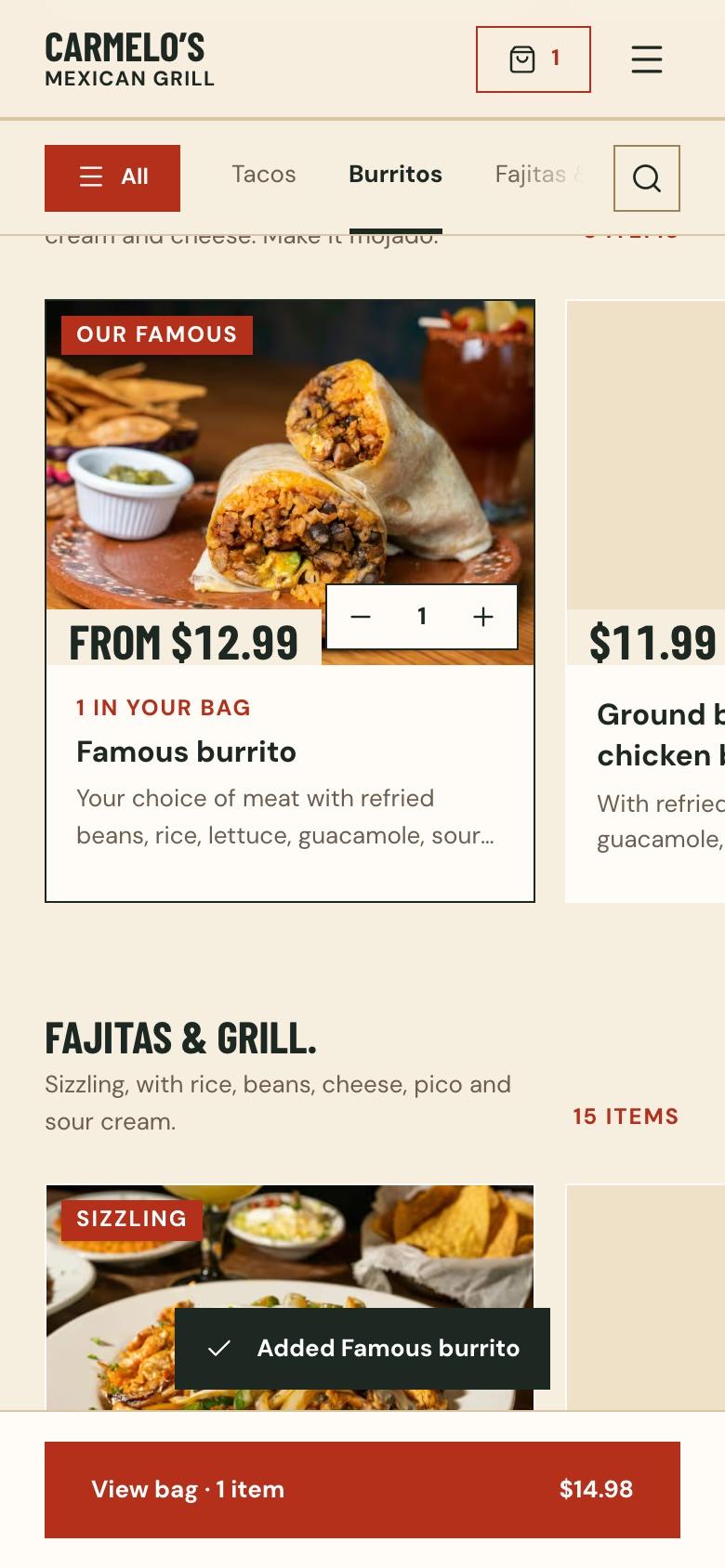
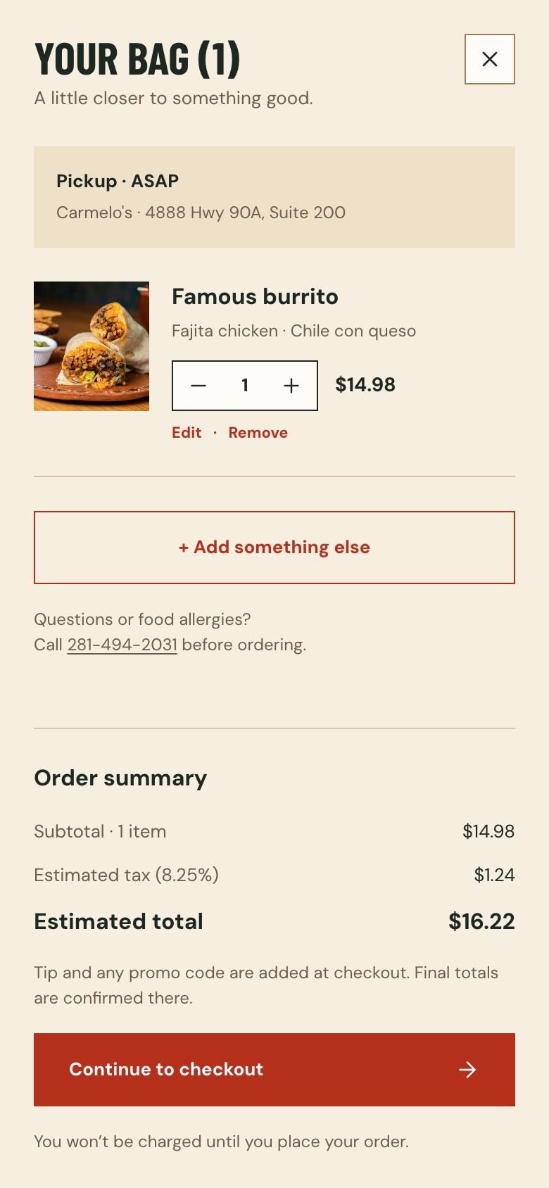
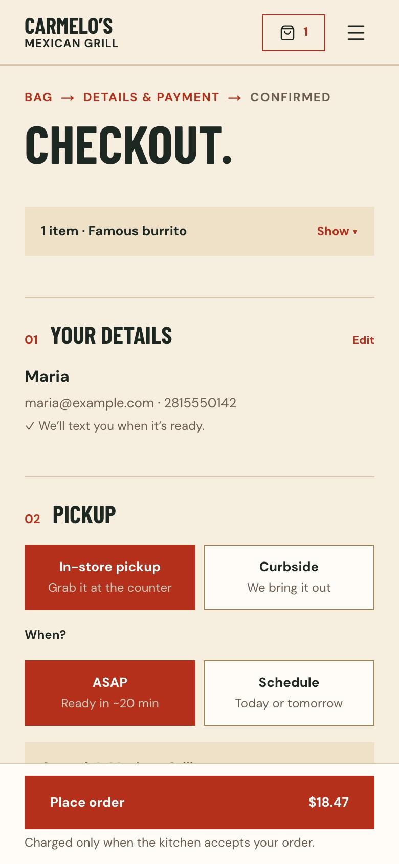
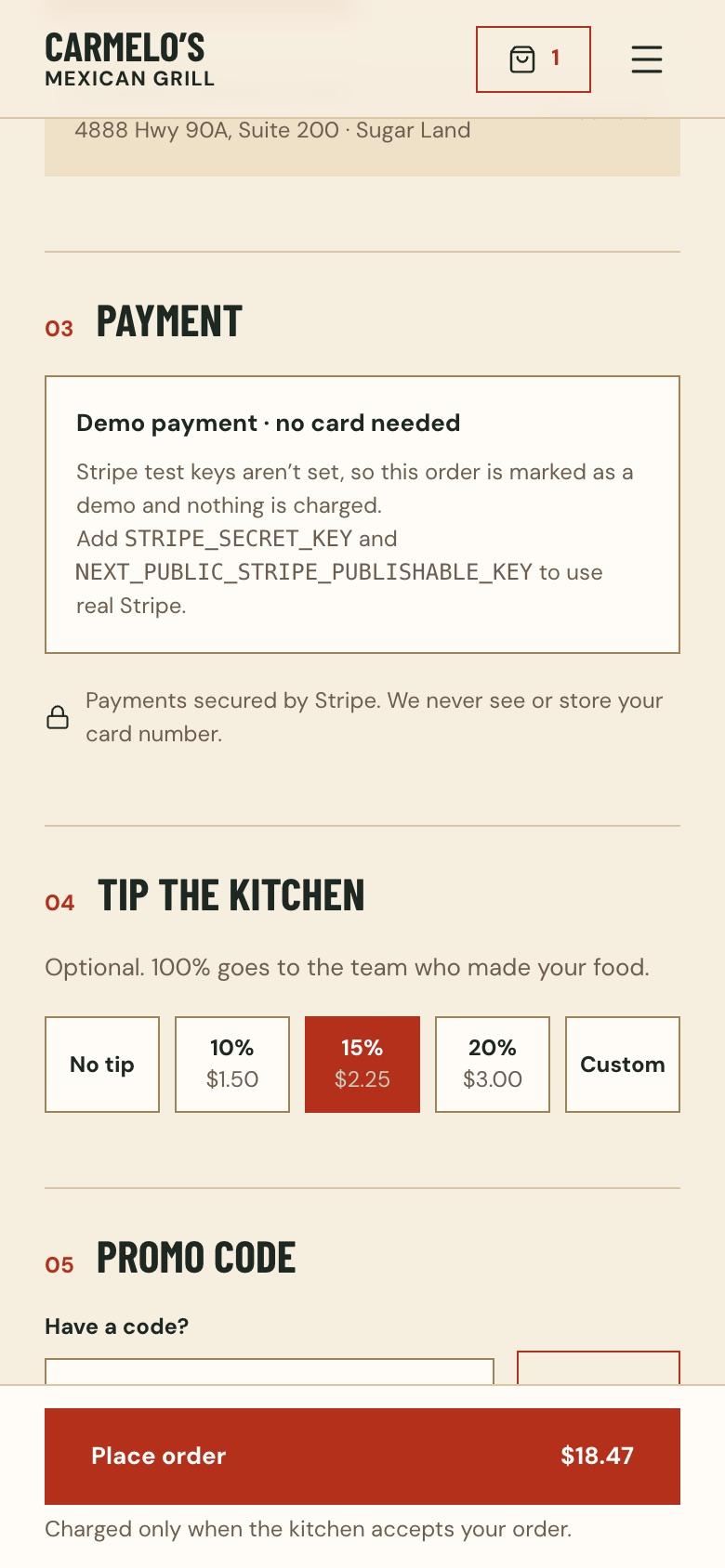
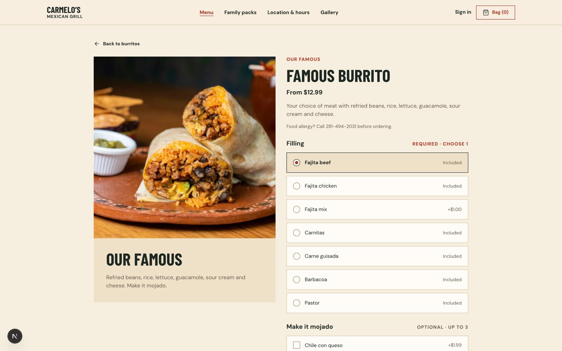
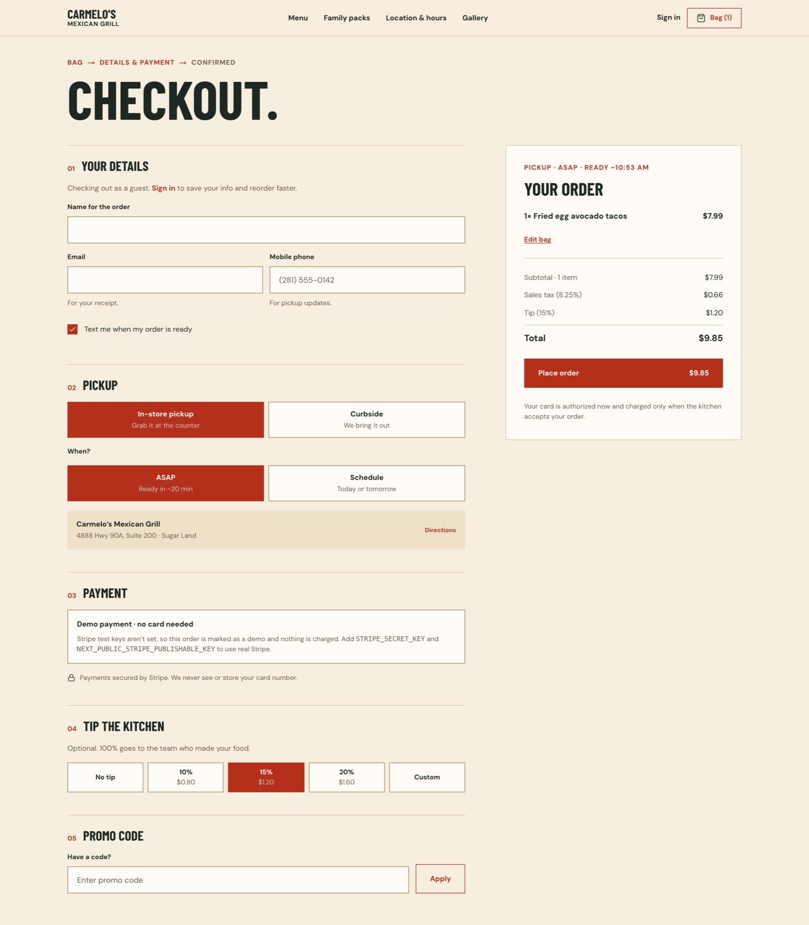
The whole flow on a phone, from the homepage to a ready time. These are real screens from the working build, played in order. Pause it, or jump to any step.
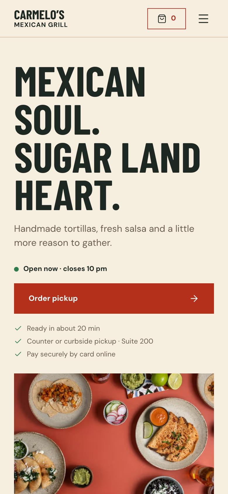
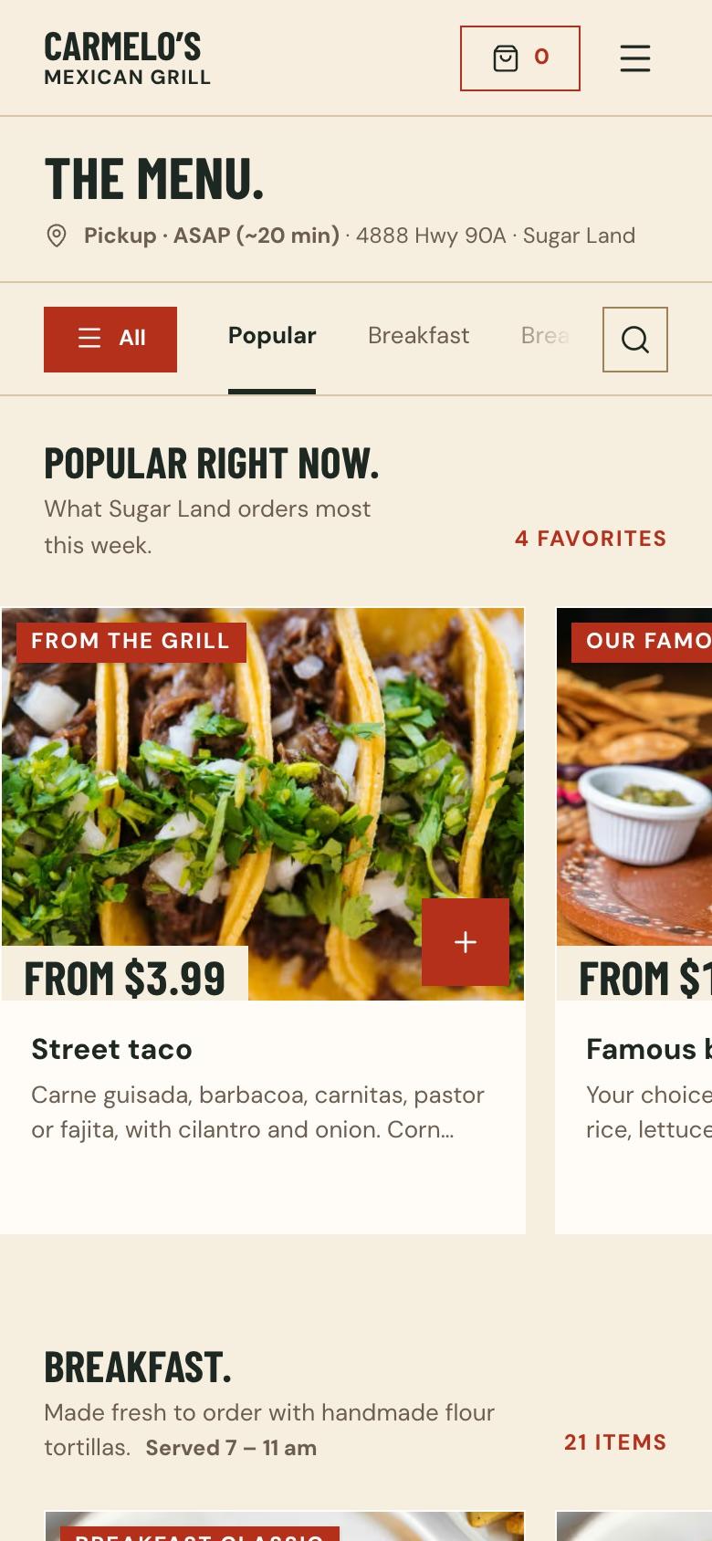
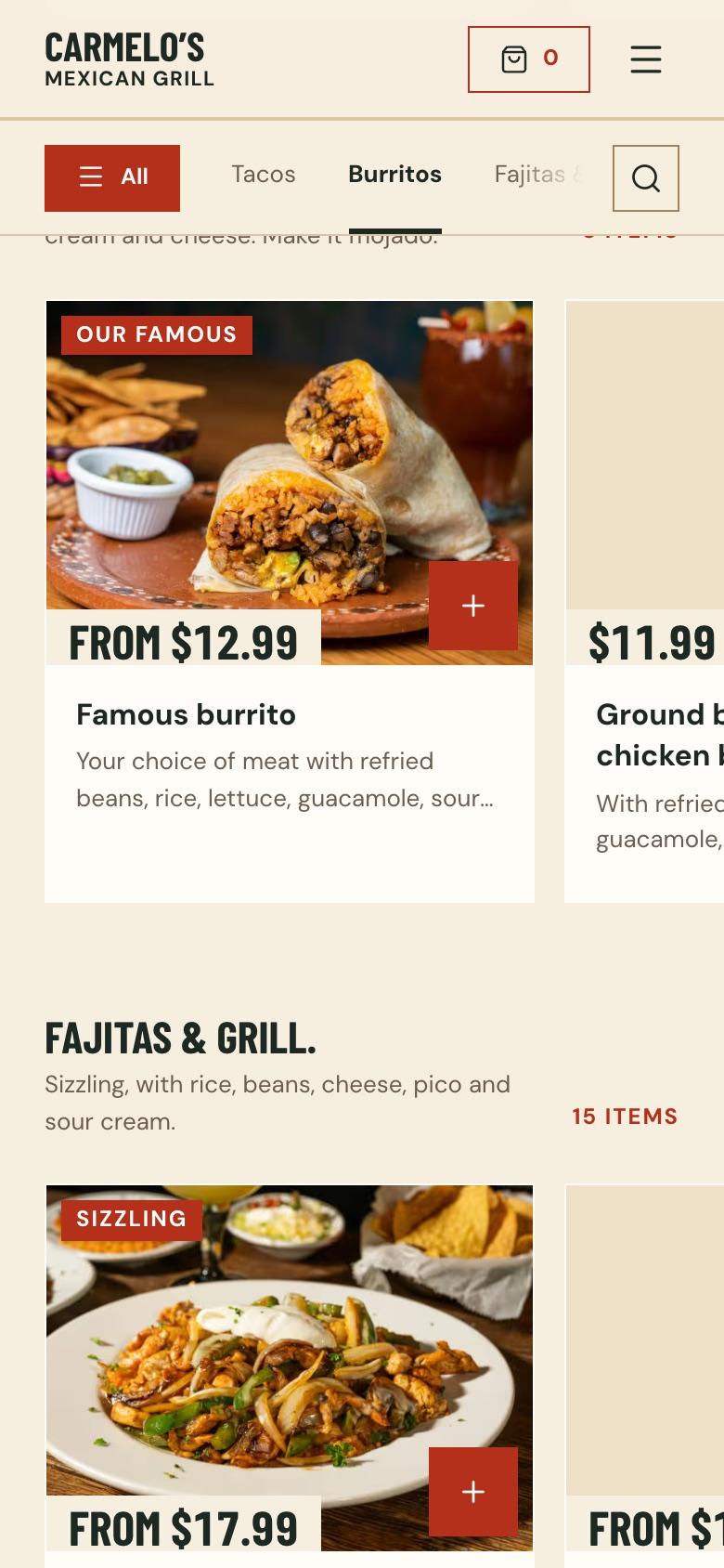
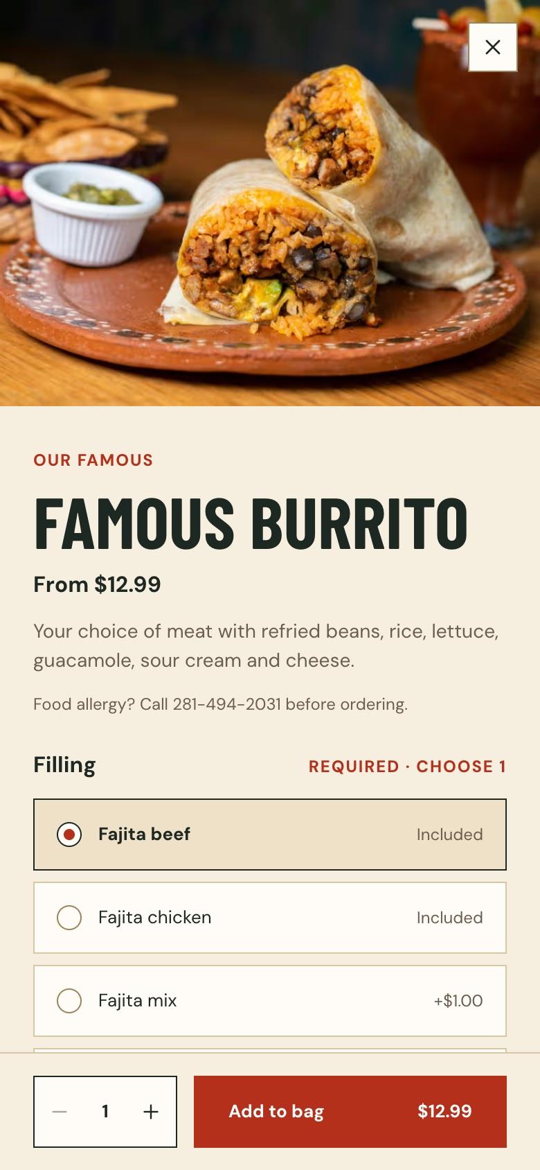
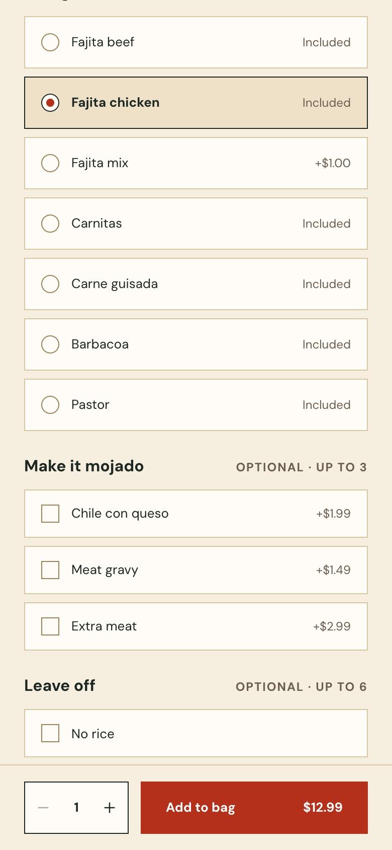
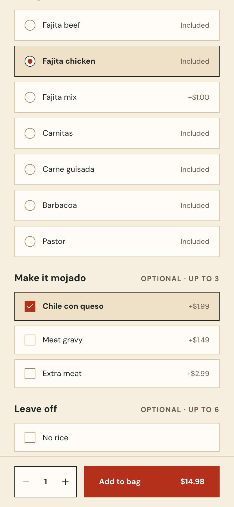
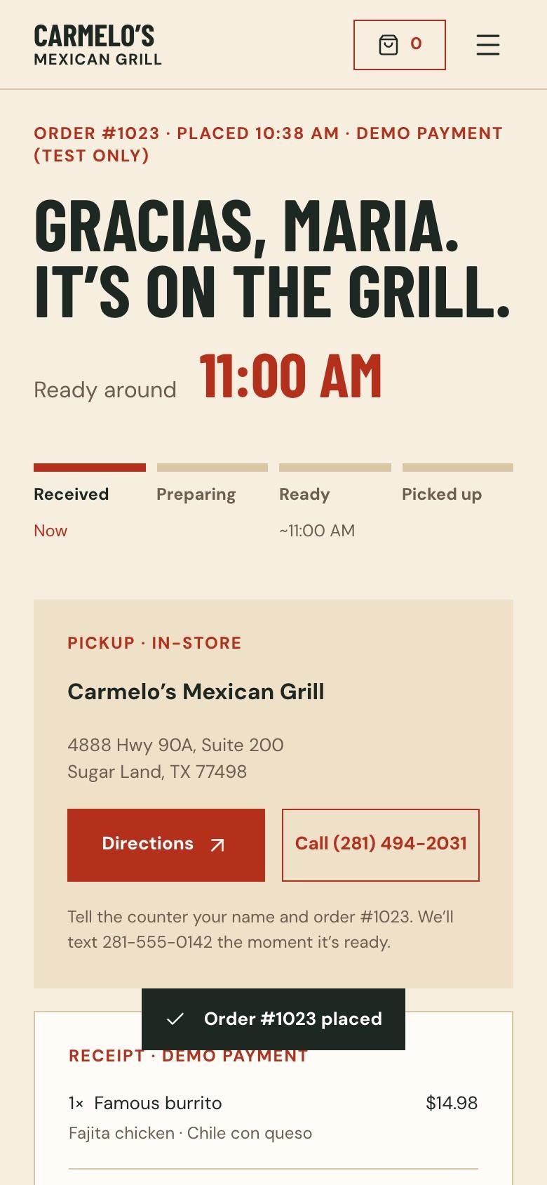
Prototype · pickup order on a phone
Decisions that shaped the flow
- Guest checkoutNo account wall. After the order, guests can add a password to save their details for a one-tap reorder.
- Authorise, then captureStripe holds the amount when the order is placed and charges only when the kitchen accepts — so a declined order is never a refund.
- Honest closed stateWhen the store is closed the menu says so at the top and on every card (“Opens 7 am”), instead of letting someone customise a burrito first.
- Price on the buttonThe add button carries the running price, so options never surprise anyone at checkout.
- Allergy routeAllergy questions go to a phone call before ordering — the honest answer for a kitchen without a certified allergen process.
Heuristic review: the landing page
Once the pages worked, I reviewed them against Nielsen’s ten usability heuristics, with a second pass from an automated design detector. The landing page scored 25 of 36 (one heuristic didn’t apply): acceptable, but it sold the restaurant better than it sold an order.
| PRIORITY | FINDING | FIX |
|---|---|---|
| P1 | One order button, only at the top; dish cards said “Explore…” and the page ended on the gallery | Priced dish cards that open the dish, a closing order band, a sticky “Order pickup” bar on phones |
| P1 | No signal colour: the order button and “View bag” were both ink, so nothing said “start here” | A warm chile-red action colour used only for ordering, and a live open-now dot |
| P2 | Featured cards had no price and two separate tap targets | Price on every card, one target per card |
| P2 | Every section used the same template, with filler “01–04” labels | Dropped the numbering, one full-bleed photo moment, varied headline scale |
| P2 | No pickup reassurance | A three-item strip under the hero: ready time, where to pick up, how to pay |
Heuristic review: the menu
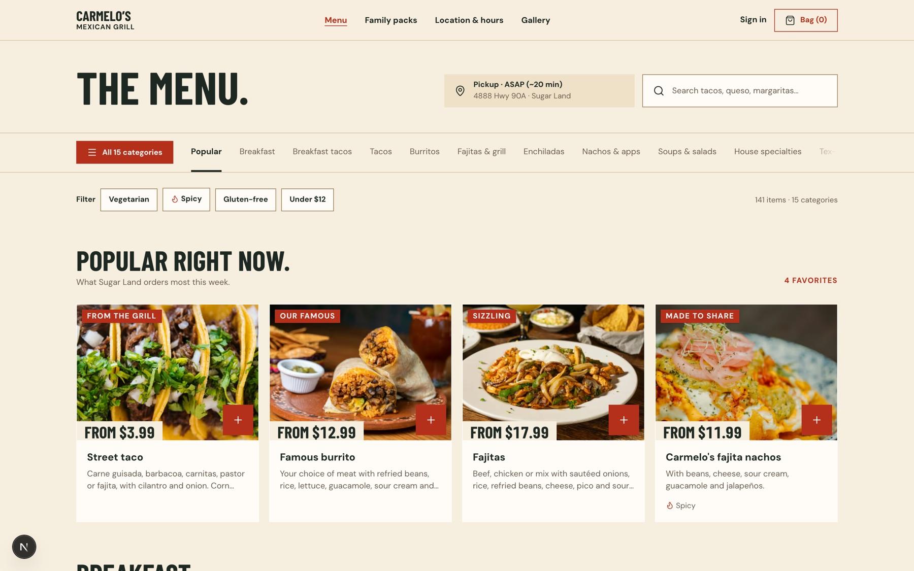
The menu is where people actually work, so I reviewed it as a tool, not a brochure. It scored 27 of 40. The worst problems were about honesty and distance: the page said “ASAP” while the store was closed, and on a phone the first dish sat about 900px down.
| PRIORITY | FINDING | FIX |
|---|---|---|
| P1 | Closed state contradicted (an ASAP chip) and announced only after customising | Closed note at the top and on each card; the sheet states the reason first |
| P1 | Too much above the menu on phones | A compact header with search inside the sticky bar; first dish above the fold |
| P2 | 15 categories in a strip with an icon-only “All” and no scroll cue | Labelled “All 15 categories” button, edge fade, active tab kept in view |
| P2 | Dietary info lossy: one tag per card, no allergen note | All dietary tags on cards and in the sheet, allergy line at the top |
| P3 | A generic sheet slogan; corn vs flour price buried in text | Panel copy written from the menu itself |
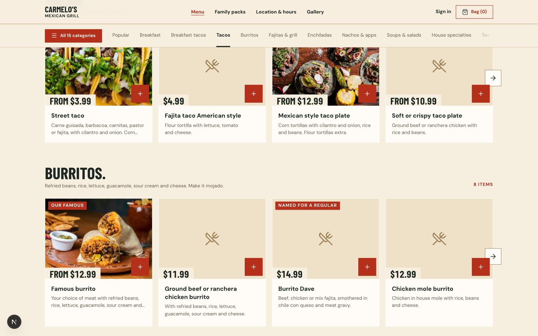
Three directions for the menu card
The card is the most repeated thing on the site — 141 of them — so I explored it properly. I built three directions side by side, in both vertical and horizontal layouts, using real dishes and real photos.
- A
Photo-led
Big photo, the price painted on it like a menu-board tag, one red add button. The food does the selling.
- B
Menu board
Name, dotted leader, price — reads like the board at the counter. Calm and distinctive, but the photo plays second.
- C
Compact
Small square photo, one-line copy, the price is the add button. Fits the most dishes per screen.
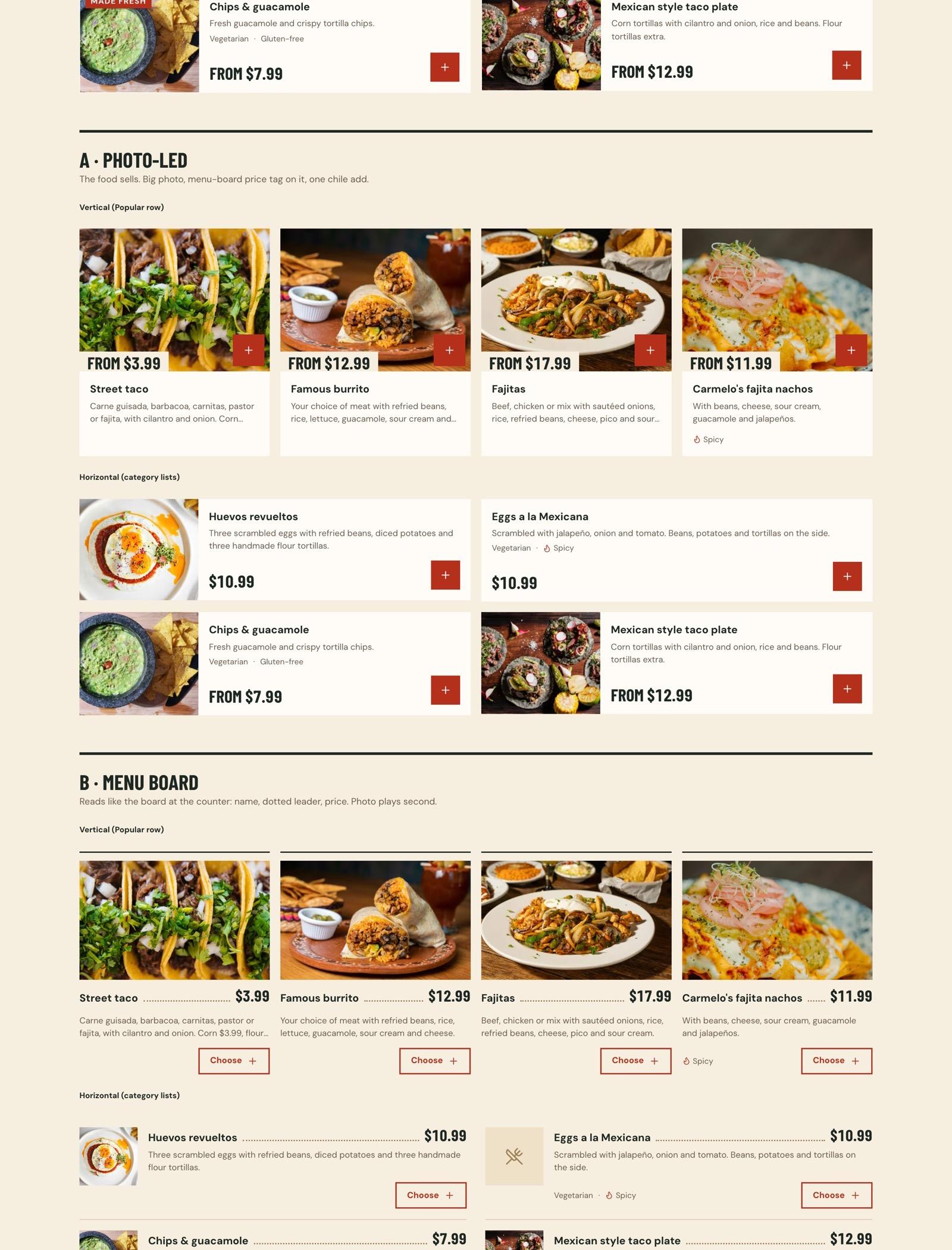
A won. Carmelo’s photos are its strongest asset, and on a phone the photo is what stops the thumb. I then moved categories from a two-column list to carousels of A cards, floated each dish’s own label (“Our famous”, “Named for a regular”) onto the photo, and gave dishes without a photo a consistent placeholder tile so rows still line up.
Colour that means “order”
The first build was ink on cream: tasteful, and silent. The review showed nothing signalled where to act. I warmed the background to masa — the colour of fresh tortillas — and gave every order action a single chile red, so red always means “this moves your order forward.” The staff app and the Stripe payment form use the same values.
| ROLE | TOKEN | VALUE | USED FOR |
|---|---|---|---|
| Page | masa | #f6eedf | Storefront background |
| Surface | surface | #fffcf6 | Cards, sheets, inputs |
| Action | chile | #b5301b | Every order button and selected control |
| Action hover | chile-deep | #9c2814 | Hover and pressed states |
| Text, secondary | earth | #6b5d4f | Descriptions and captions |
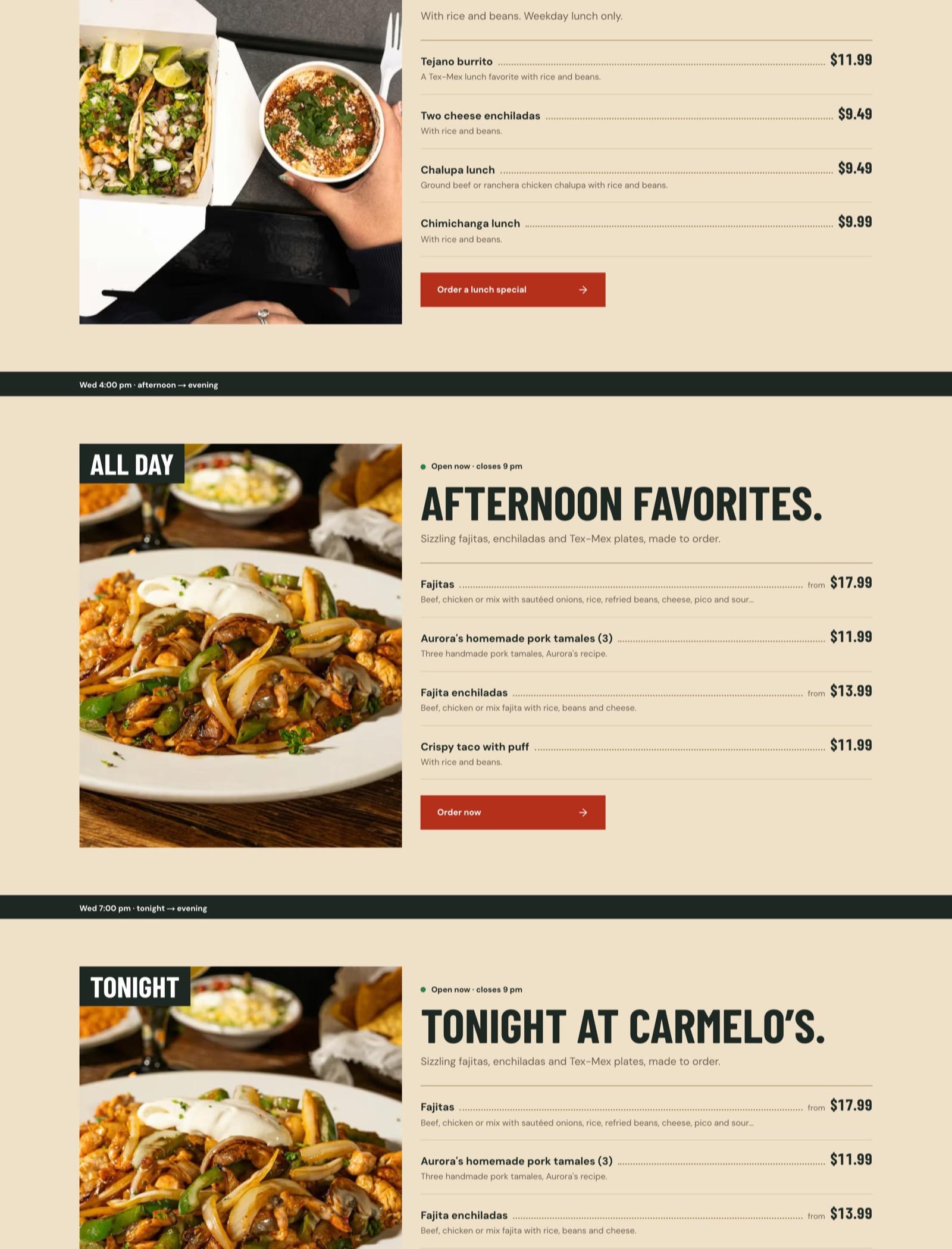
A homepage that knows what time it is
Carmelo’s menu changes through the day: breakfast until 11, lunch specials on weekdays until 3, then fajitas and enchiladas into the evening. The homepage now shows the meal that’s being served right now, straight from the store hours in the CMS — and when the store is closed, it previews the next meal and when it opens.
The kitchen side
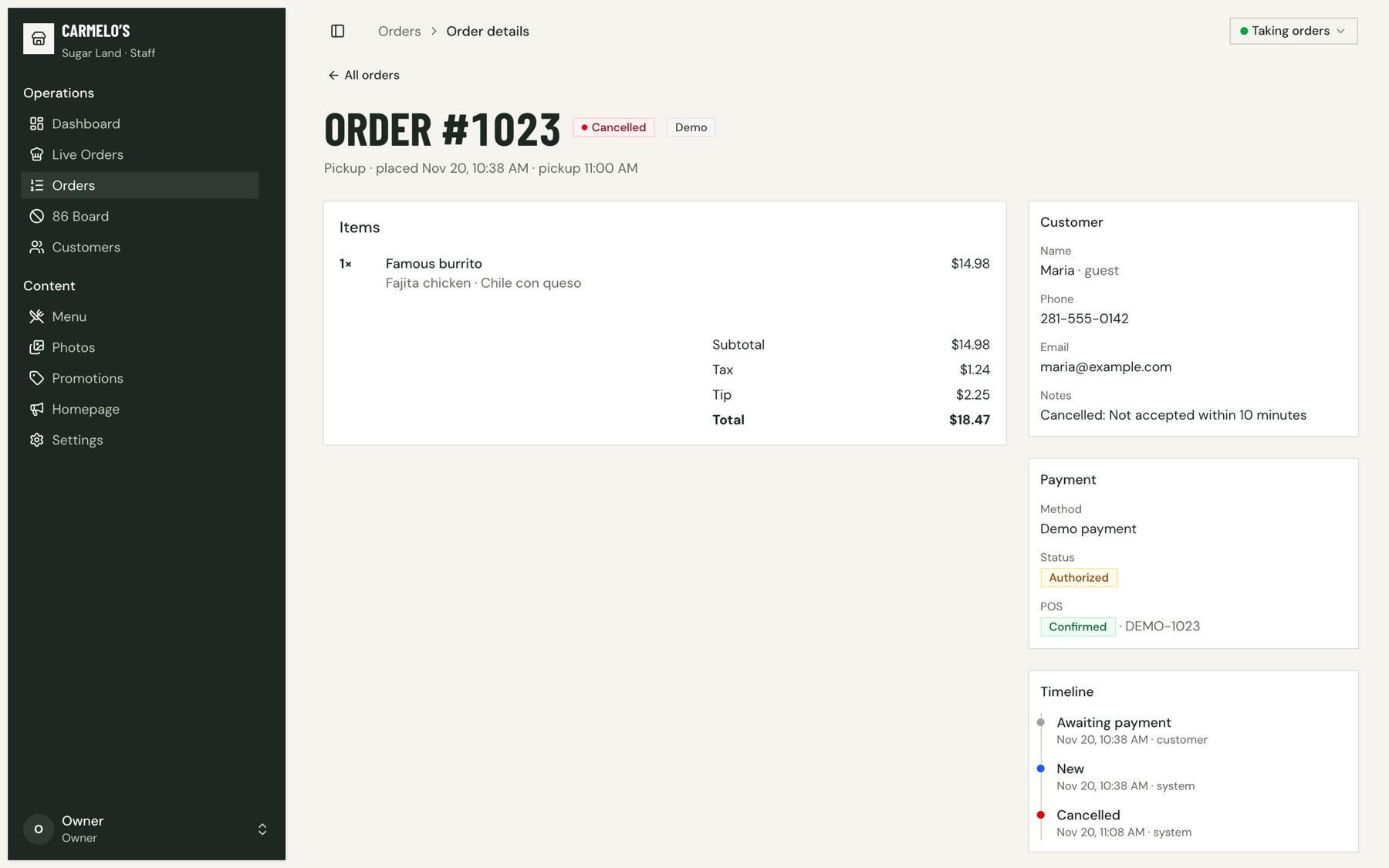
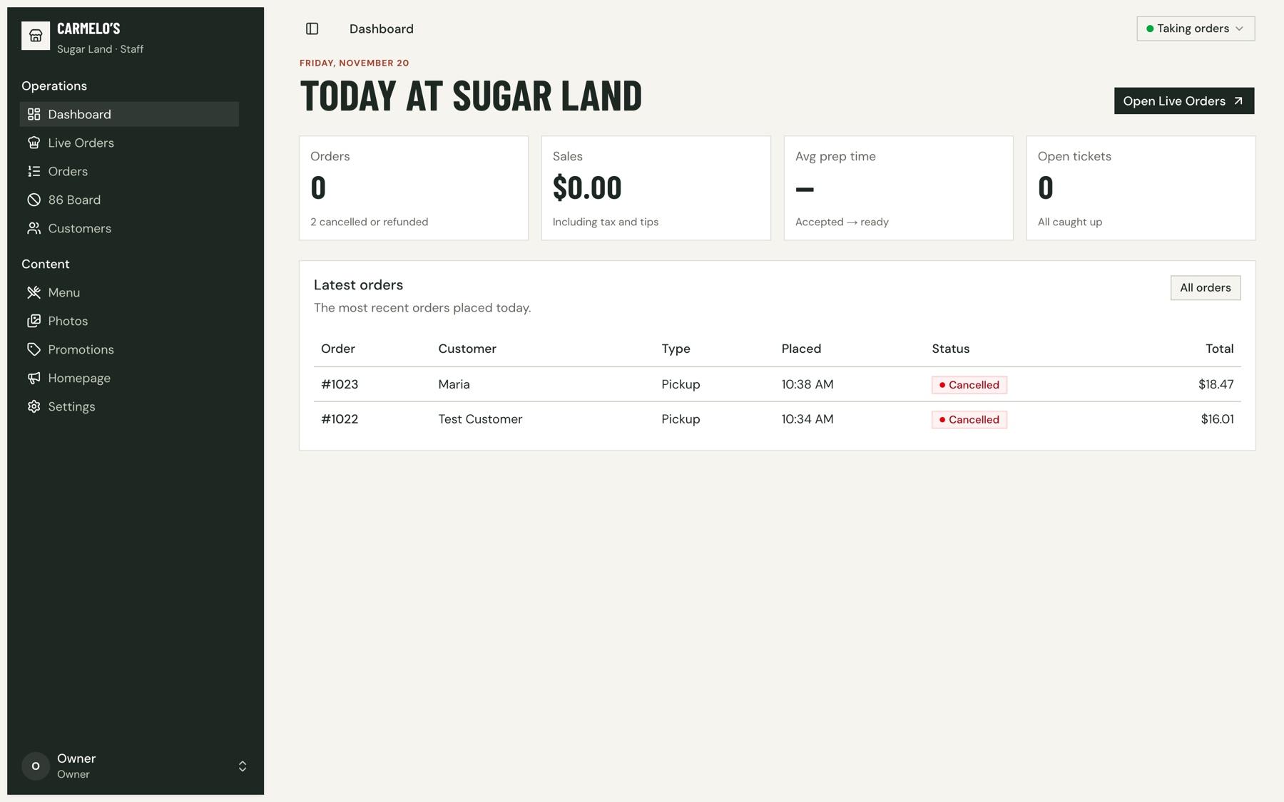
An order is only as good as the ticket the kitchen sees. The staff app, built on shadcn with the same tokens, gives the team a live orders board, an order queue with accept, ready and refund actions, an 86 board to mark dishes sold out, and a menu table for quick price and availability changes. Statuses are colour-coded so a busy cook can read the board at a glance.
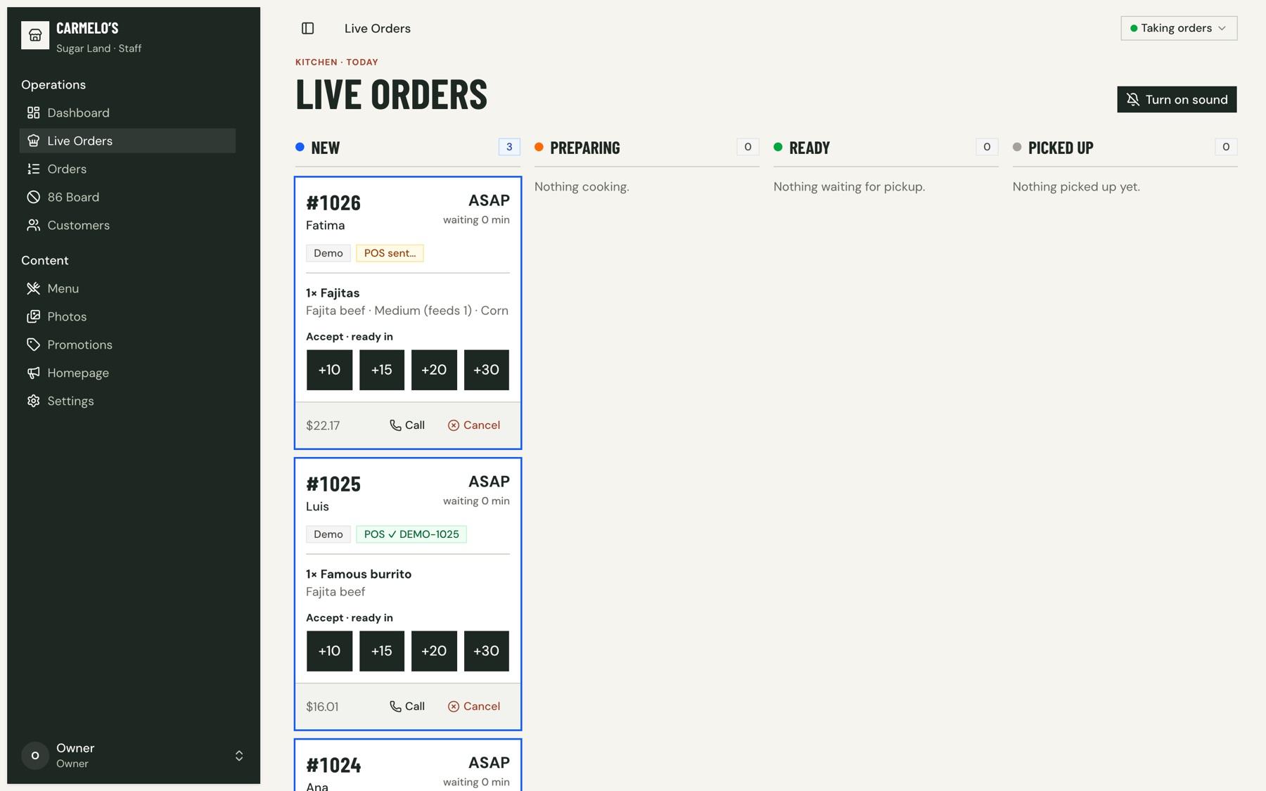
- Accept sets the promiseAccepting a ticket means picking +10, +15, +20 or +30 minutes. That becomes the customer’s ready time — and the moment the card is charged.
- Nothing waits foreverAn order nobody accepts within 10 minutes cancels itself and the card hold is released, so a customer is never left wondering.
- One trail per orderEvery order keeps a timeline (placed, accepted, ready, picked up, refunded) and its point-of-sale status.
What’s next
This is a working concept, not a launch. The next step is putting it in front of the owners, with the current site beside it.
For the pitch
- Walk the owners through ordering on their own phones
- Show the CMS: change a price, 86 a dish, pause ordering
- Agree what success looks like before any launch
Before launch
- Live Stripe keys, email and text receipts
- Connect the real POS (the build uses a demo adapter)
- Pull Google reviews into the homepage
- Photograph the breakfast menu — most of it has no photos yet