Case study · Design system · React component library
SagUI
A React design system with motion built in — tokens, 60+ components, Storybook, a docs site, and an MCP server so AI tools build with the system instead of around it.
69
12
2
1
Overview
SagUI is a design system I built as a single npm-workspaces monorepo: @sagui/tokens for semantic colour, type, radius, elevation and motion; @sagui/ui for the React components; a Storybook deployed to GitHub Pages; and a Next.js docs site on Vercel.
Its defining idea is that motion is part of the system, not decoration added per screen. Springs, durations and easing are tokens, every component ships with its motion already tuned, and all of it respects prefers-reduced-motion.
01 · The problem
Most component libraries stop at static states. Teams then hand-roll transitions screen by screen, timings drift, dark mode breaks where someone hard-coded a colour, and AI coding tools — now writing a large share of UI — invent props that don't exist.
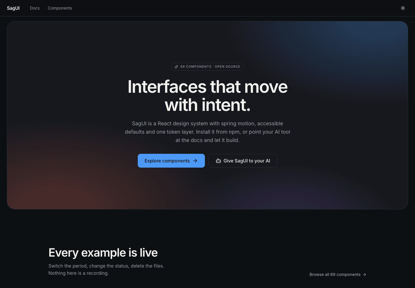
The goal: a system where the right choice is the easy one — for designers, developers, and the agents working alongside them.
02 · Foundations & tokens
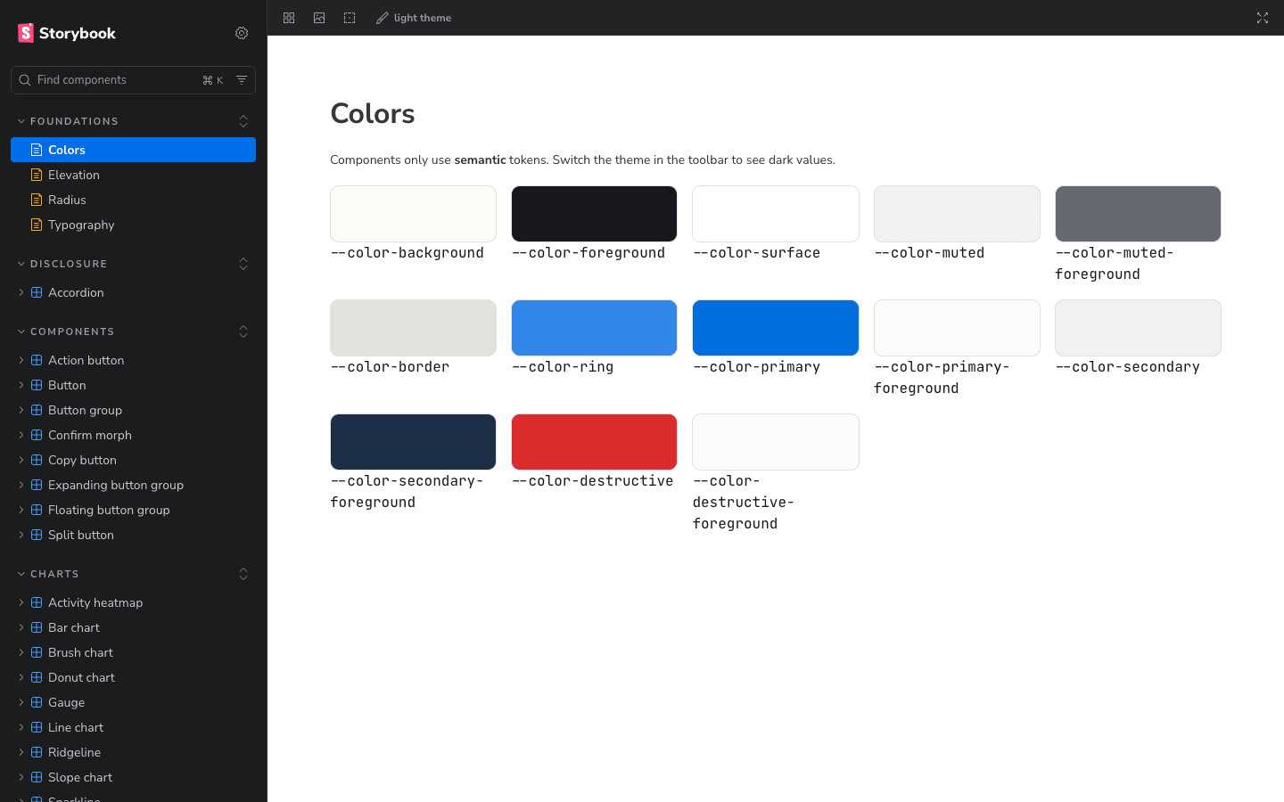
Everything starts in @sagui/tokens. Components never reference raw values; they reference roles, so a theme swap or a rebrand is a token change.
01
Semantic colour, light + dark
Role-based colours (surface, ink, border-strong, success, warning, danger) with dark mode toggled by a single data-theme attribute on <html>.
02
Type scale with roles
An explicit type scale with tracking on the large steps, exposed as type-* role utilities so headings and labels stay consistent.
03
Radius & elevation roles
Radius roles (control, container, overlay, pill) and five elevation levels, with theme-aware shadows that get denser in dark mode.
04
Motion as tokens
Spring and ease presets plus duration tokens (instant → considered). Components pick a role, not a millisecond value.
03 · Component library
Components are built on Radix primitives for behaviour and accessibility, CVA for variants, Motion for animation, and Tailwind v4 for styling. They were shipped in families so each set shares patterns.
01
Buttons
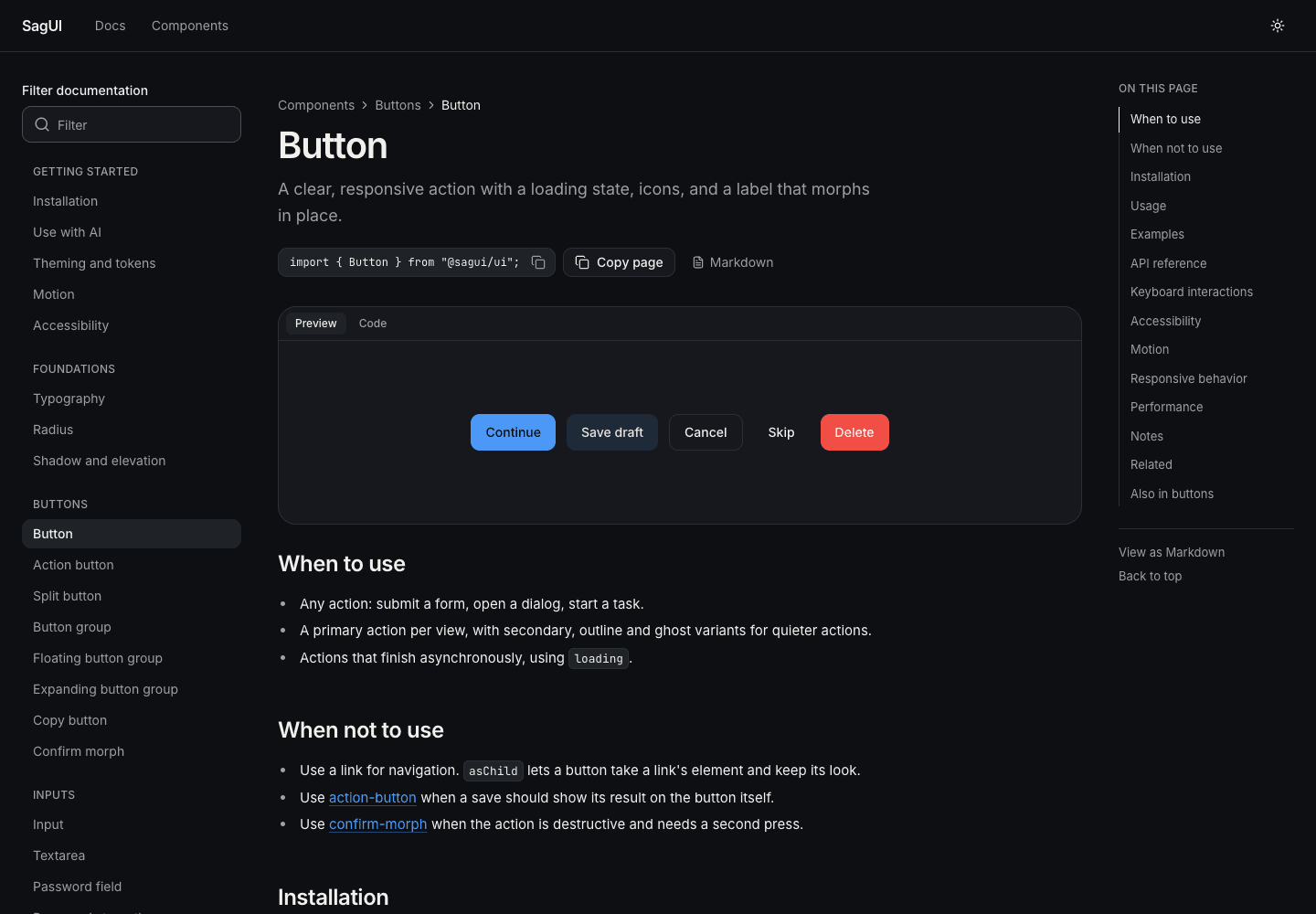
Button, ActionButton, SplitButton, ButtonGroup, CopyButton and ConfirmMorph — labels morph, loading keeps focus.
02
Inputs & selection
Input, PasswordStrength, MoneyInput, PhoneInput, TagInput, Combobox, MultiSelect, MorphSelect, RadioCards, SegmentedControl.
03
Messages & overlays
Alert, Toast, Dialog, Drawer, BottomSheet, Popover, and a Tooltip that crossfades text and resizes on a spring.
04
Data & charts
MetricCard, SortableDataTable, Timeline, and 12 charts — line, bar, donut, gauge, streamgraph, waffle, slope, heatmap, ridgeline, treemap.
05
App shell
An original AppShell: sidebar that folds to an icon rail (⌘/Ctrl + B), becomes a drawer under 1024px, plus an inset variant.
06
Text & motion effects
TextReveal, InViewTitle, TextMorph and TextShimmer for considered, reduced-motion-safe emphasis.
04 · Quality bar
Every component passes the same checklist before it ships. The checklist is the definition of done, not an aspiration.
- CVA variants and sizes, with focus, disabled and loading states
- Reduced-motion behaviour defined, not left to chance
- Stories for default, variants, sizes and states
- Passes the Storybook a11y addon in both light and dark themes
- A changeset describing the change for versioned releases
05 · Docs that can't drift
Component pages are written in Markdown with live demos marked inline. Each demo is defined once in a source file between region markers, and the docs' Code tab renders that same source — so the example a reader copies is exactly the one running on the page.
01
Single source for demo and code
Demos live in <slug>.demos.tsx; Markdown references them by name. No pasted snippets to fall out of date.
02
Versioned releases
Changesets drive a Release workflow that opens a version PR and publishes to npm. CI builds Storybook to GitHub Pages.
06 · Built for AI-assisted teams
A design system is only useful if it's what actually gets used. With so much UI now written with AI, SagUI exposes itself to agents directly.
01
Hosted MCP server
The docs site serves an MCP endpoint, so tools like Claude look up real components and documented props instead of guessing.
02
Storybook MCP
Stories are queryable by agents too, giving them variants and states to reference while building.
03
Project skill
A sagui-sales-analytics skill encodes the rules — SagUI component first, documented props only, tokens only, both themes, accessible by default.
The system's guardrails travel with the code — whether a person or an agent is writing it.
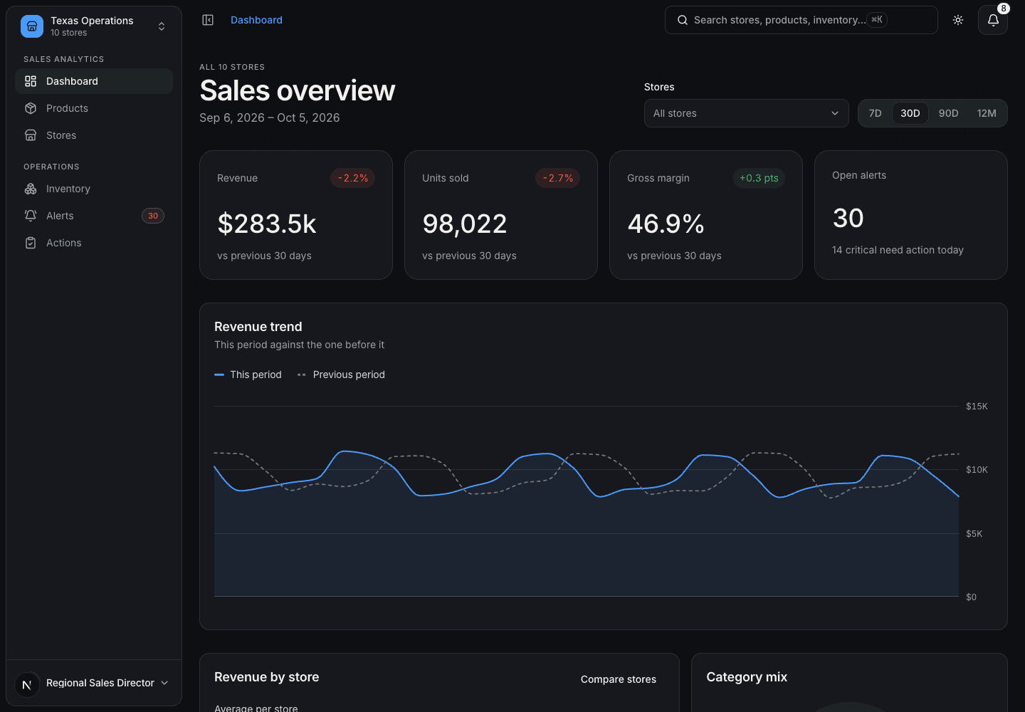
07 · Proven in a real product
SagUI was validated by building a full Sales Analytics dashboard entirely on it, installed as a packaged dependency outside the monorepo. That surfaced real gaps — bundling motion tokens for external apps, dark-theme rules dropped by the browser — which were fixed back in the system.