Case study · Data product · Dashboard design
Sales Analytics
A sales analytics dashboard for a regional leader running 10 convenience stores — not just charts, but an alert inbox and action tracker that turn what the data shows into what the team does next.
10
2 yrs
6
0
Overview
A regional sales leader responsible for ten convenience stores needs to answer the same questions every morning: what's selling, what isn't, which stores are slipping, and what's about to run out.
Sales Analytics answers those questions and then closes the loop. It surfaces the highest and lowest sellers, compares stores, raises inventory and sales alerts, and tracks the actions taken on them — built on the same master data as my MDM platform and entirely on the SagUI design system.
01 · The problem
Most retail dashboards stop at reporting. They show a red number and leave the manager to work out why, decide what to do, and remember to follow up — in a spreadsheet, an email thread, or not at all.
A dashboard earns its place when it shortens the distance between noticing a problem and fixing it.
02 · Designing for the regional lead
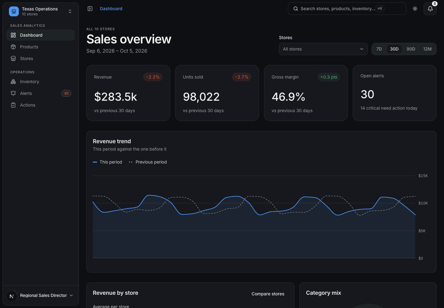
The primary user is a regional sales leader who scans broadly, then drills into one store or one SKU. Every page follows that rhythm: summary first, comparison second, detail on demand.
01
What changed since yesterday?
The dashboard leads with KPI cards and period-over-period deltas, filterable by 7, 30, 90 or 365 days and by store.
02
Where do I look first?
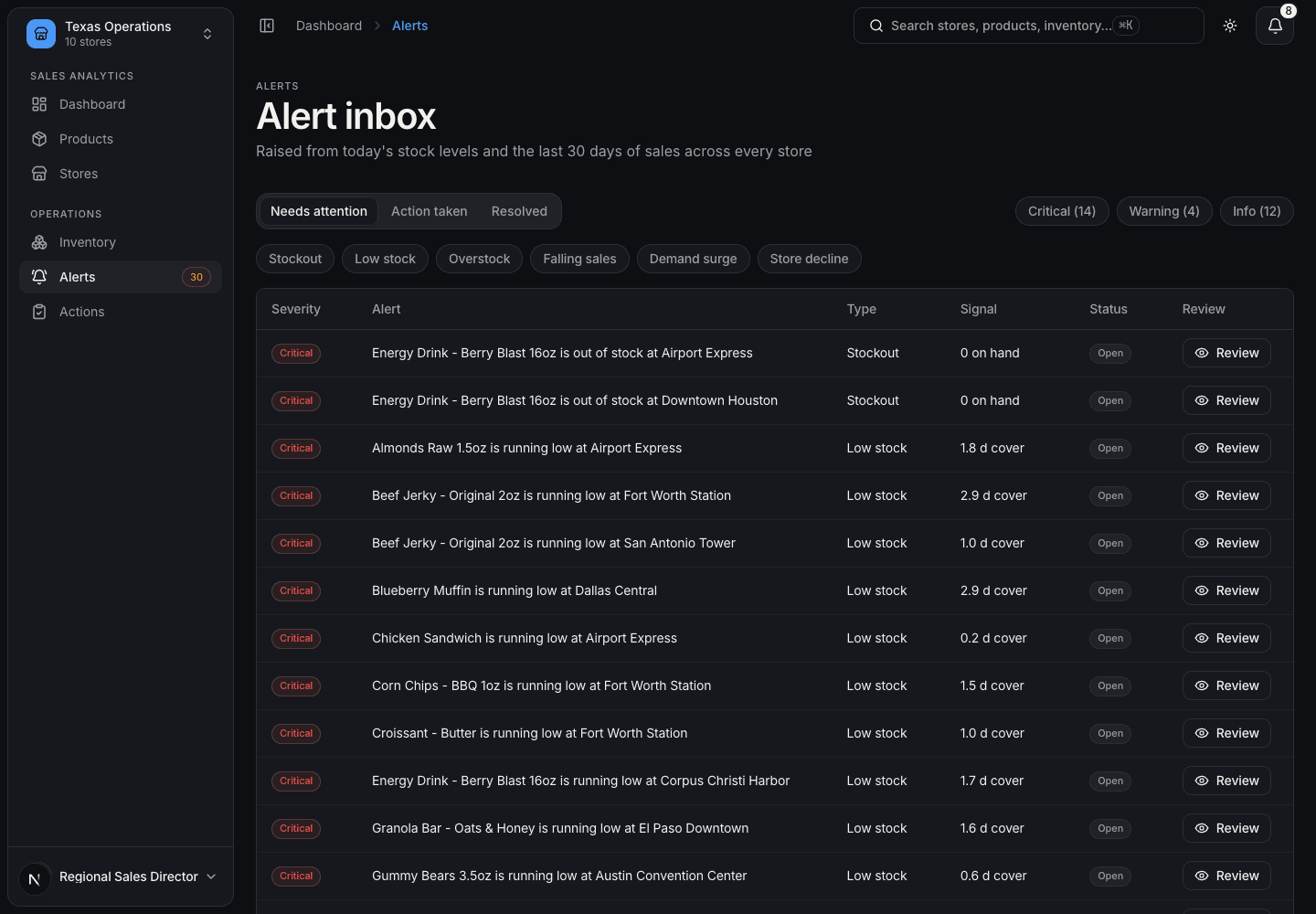
Alerts are ranked by severity — critical, warning, info — so the inbox is a to-do list, not a log.
03
What should I do about it?
Every alert carries a recommended action the lead can accept, adjust, or assign in a couple of clicks.
03 · Information architecture
Six sections, each answering one question, with drill-down detail pages for individual stores and products.
01
Dashboard
Headline KPIs, trends, and the most urgent alerts at a glance.
02
Products
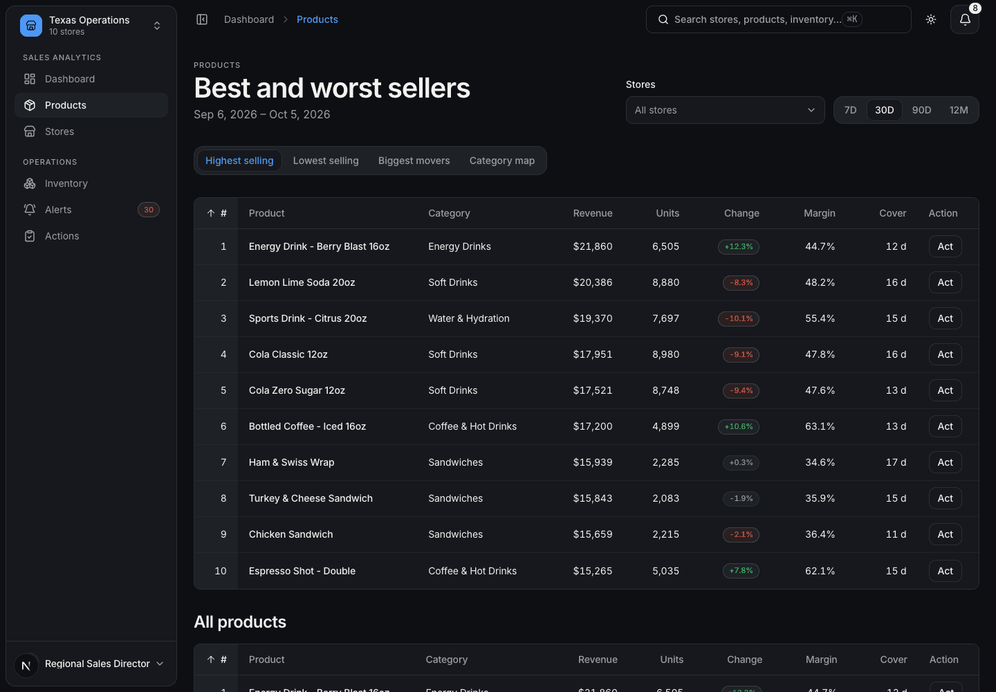
Best and worst sellers, biggest movers, and a category treemap. Per-SKU detail.
03
Stores
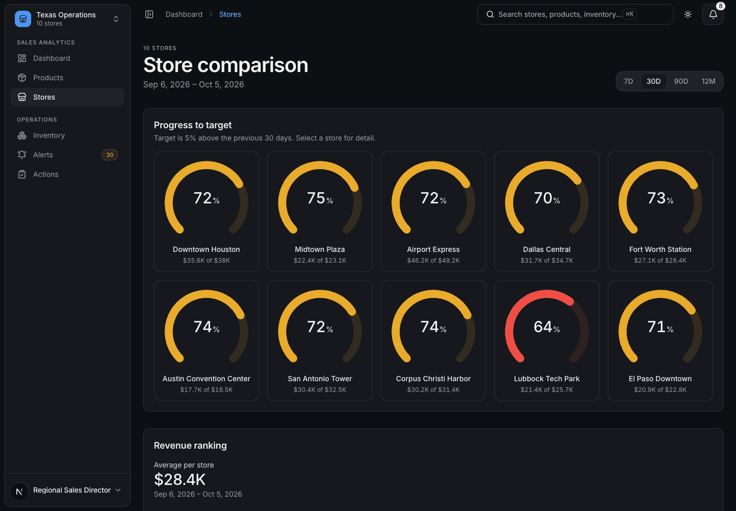
Targets, ranking, and per-store detail with its own trends and alerts.
04
Inventory
Stock status across stores — out, low, healthy, over — with days of cover.
05
Alerts
An inbox with status (open → acknowledged → actioned → resolved) and suggested actions.
06
Actions
A tracker for reorders, transfers, markdowns, notifications and tasks — owner, due date, status.
04 · From alert to action
The core design work was the alert model. Each alert type maps to a likely response, so the system can pre-fill the action and the lead only has to confirm.
01
Stockout → Transfer, then reorder
Critical. If another store has surplus, suggests transferring units from it first; otherwise a vendor reorder.
02
Low stock → Reorder
Warning, escalating to critical under three days of cover. Pre-fills the quantity to refill to shelf maximum.
03
Overstock → Markdown
Info. Suggests a 20% markdown for two weeks, or a transfer to a store that's short.
04
Slow mover → Promotion
Warning. Suggests a 15% promotion and a shelf-placement review with the vendor.
05
Surge → Chain-wide order
Info. Suggests an order covering two weeks of the new demand so a hot product doesn't sell out.
06
Store decline → Notify
Warning. Asks the store manager for a recovery plan this week.
05 · Data with a story
Real sales data wasn't available, so I wrote a seeded generator that builds two years of daily sales and a stock snapshot from the MDM master data — 10 stores, 25 products, 16 categories, 10 vendors. The same seed always gives the same numbers, so design reviews and tests see identical results.
- An energy drink surging chain-wide — and out of stock at two stores
- A spinach salad in sharp decline — and overstocked
- A tech-park store steadily losing traffic over the last quarter
- An airport store that is consistently the busiest
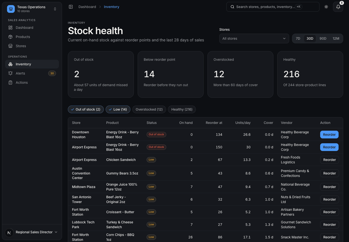
Planting these scenarios meant every screen had a real problem to surface, which made it possible to judge whether the design actually led the user to it.
06 · Built entirely on SagUI
The whole interface is composed from SagUI — AppShell, MetricCard, SortableDataTable, line, bar, donut, slope, waffle, treemap and activity-heatmap charts, Dialog, Toast, and the form controls. The app contains layout code, not custom components.
01
Tokens only
No hex values or Tailwind palette classes in app code, so light and dark themes work everywhere by default.
02
A skill as guardrail
A project skill gave Claude the rules — SagUI component first, documented props only, accessible labels on every chart.
03
Feedback into the system
Building a real product exposed gaps in SagUI — packaging, dark-theme chart styles, an inset AppShell — fixed upstream.
07 · What's next
- Connect to live POS and inventory feeds in place of generated data
- Role-based views for store managers alongside the regional lead
- Alert thresholds the lead can tune per store and category
- Measure time from alert to resolved action as the product's success metric